Understanding What Makes APM Dashboards Actually Work
Application Performance Monitoring (APM) dashboards are more than just visually appealing displays of metrics. They serve as the central hub for gaining insights into the health and performance of your applications. They translate complex data streams into actionable information, allowing teams to understand and optimize their application’s behavior. But what truly distinguishes effective APM dashboards from those that fall short? The key lies in how they transform raw data into meaningful narratives about performance.
From Data Deluge to Actionable Insights
Effective APM dashboards go beyond simply presenting data; they tell a story. This narrative is crucial for pinpointing bottlenecks, optimizing performance, and ultimately enhancing user experience. For instance, a dashboard might reveal that during peak traffic periods, database queries become sluggish, impacting overall application responsiveness. This insight empowers developers to isolate the problem area and implement effective solutions, like query optimization or database scaling.
Understanding these performance patterns also enables informed business decisions. It helps companies proactively scale resources to meet anticipated demand and prevent performance degradation.
The infographic below visually demonstrates the significant impact an effective APM dashboard can have. It compares key performance indicators (KPIs) with and without an APM solution implemented.
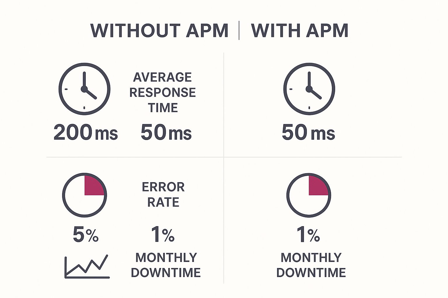
As illustrated, implementing an APM solution dramatically improves average response time, reduces error rates, and minimizes monthly downtime. This translates to a more positive user experience, increased reliability, and considerable cost savings.
The value of APM is further underscored by market projections. The global APM market is expected to reach USD 21.30 billion by 2032, expanding at a CAGR of approximately 11.31% between 2025 and 2032. This growth is driven by the increasing integration of AI and machine learning, which enhances capabilities like automated anomaly detection and predictive analytics. You can learn more about this market growth in the Global Application Performance Monitoring Market report.
Core Components of an Effective APM Dashboard
Several key elements set apart a truly effective APM dashboard from a basic data visualization tool. These features work in concert to provide a comprehensive overview of application performance and empower teams to be proactive.
To help understand these differences, let’s look at a comparison of traditional and modern APM dashboard features.
The following table highlights the key distinctions between traditional monitoring approaches and the advanced capabilities of modern AI-enhanced dashboards.
| Feature | Traditional Monitoring | Modern APM Dashboard | Key Benefits |
|---|---|---|---|
| Data Presentation | Static reports, limited visualizations | Dynamic, interactive dashboards with customizable visualizations | Improved data comprehension and faster identification of issues |
| Alerting | Basic threshold-based alerts | AI-powered anomaly detection and predictive alerting | Reduced alert fatigue and proactive issue mitigation |
| Diagnostics | Manual root cause analysis | Automated root cause identification and performance bottleneck detection | Faster problem resolution and reduced MTTR (Mean Time to Resolution) |
| Integration | Limited integration with other tools | Seamless integration with DevOps toolchains and cloud platforms | Enhanced collaboration and streamlined workflows |
| Reporting | Historical data analysis, limited customization | Customizable reports with trend analysis and forecasting | Data-driven decision making and performance optimization |
As you can see, modern APM dashboards offer a significant advantage in terms of functionality, automation, and insights.
-
Real-Time Monitoring: This crucial feature delivers up-to-the-second visibility into key performance indicators, allowing for immediate identification of any deviations from normal behavior.
-
Customizable Dashboards: Teams can tailor dashboards to their specific requirements, focusing on the metrics most relevant to their roles and responsibilities.
-
Intelligent Alerting: AI-powered algorithms filter out irrelevant alerts and prioritize critical notifications, reducing alert fatigue and ensuring prompt responses to genuine problems.
-
Performance Bottleneck Identification: The dashboard automatically pinpoints bottlenecks across the entire application stack, simplifying diagnosis and resolution.
-
Trend Analysis and Reporting: Historical performance data and trend analysis allows for proactive identification of potential problems and optimization opportunities. For more insights on maximizing your APM strategy, check out our guide on application performance monitoring best practices.
These features allow teams to move beyond reactive troubleshooting and proactively address performance issues before they impact users. You may also be interested in learning How to Master Mobile App Performance. Together, these components contribute to a more proactive and effective approach to application performance management, leading to improved business outcomes.
Features That Actually Drive Business Results
Beyond flashy interfaces, what application performance monitoring (APM) dashboard capabilities truly make a difference? An effective APM dashboard transforms complex technical data into actionable insights that guide business decisions. This goes beyond simple data visualization. It means embracing features that promote proactive problem-solving and performance optimization.
Real-Time Visualization: Beyond Static Charts
Real-time visualization is crucial for proactive monitoring. Think of your APM dashboard as a live stream of your application’s vital signs. This lets you spot anomalies as they happen, stopping small issues before they become major outages. For example, a sudden spike in database query latency, seen in real time, alerts your team to a potential bottleneck before it affects users. This immediate feedback is key for application stability and minimizing downtime, directly impacting customer satisfaction and revenue.

Intelligent Alerting: Reducing Noise, Amplifying Signal
Traditional alerting systems often overwhelm teams with notifications, causing alert fatigue and delayed responses to critical issues. Intelligent alerting, powered by AI and machine learning, filters out the noise and highlights what truly matters. Instead of reacting to every minor fluctuation, your team receives targeted alerts about significant anomalies. These alerts often include helpful context like probable root causes and suggested solutions, speeding up troubleshooting.
Customizable Dashboards: Tailoring Insights to Your Needs
A one-size-fits-all approach rarely works for APM. Different stakeholders have different priorities. Developers might focus on code-level performance, while executives might prioritize overall availability and user engagement. Customizable dashboards let teams tailor their data view, ensuring everyone sees the most relevant information. This fosters a shared understanding of performance and promotes data-driven decisions.
Reporting That Matters: From Data to Decisions
Real-time monitoring identifies immediate issues, while historical data provides insights for long-term optimization. Comprehensive reporting turns raw data into understandable summaries, revealing trends, patterns, and areas for improvement. Reports can pinpoint recurring bottlenecks, identify peak usage times, and track the success of optimization efforts. This data empowers teams to make informed decisions about resources, capacity planning, and future development. Read also: How to master automatic app updates.
Avoiding Feature Bloat: Focusing on Functionality
A rich feature set is attractive, but an overly complex dashboard can be counterproductive. Feature bloat can confuse users and hinder effective monitoring. Prioritize features aligned with your business goals and technical needs. Start with the essentials – real-time visualization, intelligent alerting, customizable dashboards, and robust reporting. Add more features gradually, ensuring each one improves your workflow. This strategic approach maximizes the value of your APM dashboard, making it a powerful tool for driving business results.
Your First Dashboard Implementation That Actually Succeeds

Many application performance monitoring (APM) dashboard projects fail, not because of technical issues, but due to poor planning and overly ambitious goals. This section offers a practical, phased approach for implementing your first APM dashboard, ensuring it delivers value quickly and builds a foundation for future expansion.
Defining Clear Objectives
Before starting the technical setup, define your goals for the APM dashboard. What do you hope to achieve? Are you looking to reduce downtime, improve response times, or better understand user behavior? Clearly defined objectives guide your metric selection and dashboard configuration.
For instance, if improving user experience is your primary goal, focus on metrics like page load times and error rates. This focus ensures your dashboard provides relevant, actionable insights.
Selecting Key Metrics: Less Is More
Avoid the trap of tracking everything at once. Metric overload can quickly overwhelm your team and obscure important trends. Start with a small set of essential metrics directly tied to your business objectives.
This focused approach offers clarity and allows you to add more metrics as needed. Prioritize metrics relevant to your stakeholders, such as executives focused on business KPIs or developers interested in code-level performance. You might be interested in: How to master mobile app testing.
Data Integration: Start Small, Scale Gradually
Integrating data from multiple sources can be challenging. Start with a phased approach. Integrate data from the most critical systems first, then gradually add other sources.
This approach lets you derive value from your dashboard quickly while minimizing initial integration hurdles. It simplifies troubleshooting and reduces the risk of overwhelming your team.
Fostering Team Adoption: Collaboration Is Key
Successful dashboard implementation requires team buy-in. Involve stakeholders from different teams throughout the process. This fosters a sense of ownership and increases the likelihood of long-term adoption.
Regularly solicit feedback and incorporate suggestions to ensure the dashboard meets everyone’s needs. Open communication and collaboration are key to success.
Overcoming Common Obstacles
Challenges will inevitably arise, even with careful planning. Stakeholder resistance, integration complexity, and metric overload are common roadblocks. Address these proactively.
Communicate the dashboard’s benefits clearly, provide training and support, and iteratively refine your approach based on feedback. Dashboard implementation is an ongoing process, not a one-time event. The APM market has seen significant growth, from USD 9.66 billion in 2024 to an estimated USD 10.79 billion in 2025, a CAGR of roughly 11.7%. This growth is driven by the increasing complexity of IT systems and the demand for seamless digital experiences. Find more detailed statistics here. This highlights the importance of a robust APM dashboard for maintaining a competitive edge. By using a phased approach, focusing on key metrics, and promoting team collaboration, you can build a valuable tool that drives meaningful improvements in application performance and business outcomes.
Choosing Metrics That Actually Matter To Your Organization
Are you overwhelmed by the sheer volume of data generated by your applications? It’s easy to get lost in the numbers. Instead of drowning in data, focus on the metrics that truly drive informed decisions. Effective application performance monitoring dashboards rely on carefully chosen key performance indicators (KPIs) aligned with your business objectives, not just technical details. This section will guide you on how to select and use these vital metrics for maximum impact.
Aligning Metrics With Business Goals
The first step is to connect your chosen metrics with your overall business goals. If your goal is to improve user retention, concentrate on metrics directly related to user experience. Think average response time and error rate.
If, however, your primary objective is resource optimization and cost reduction, metrics like CPU utilization and memory usage become more important. This focused approach ensures your application performance monitoring dashboard provides actionable insights that contribute to tangible business results.
Essential Metrics for Application Health
A few core metrics provide a clear overview of your application’s overall health. Response time, or the time it takes for your application to respond to a user request, is a fundamental indicator of user experience. Throughput, the number of transactions processed per unit of time, shows how efficiently your application handles load.
Monitoring error rates is essential for identifying and addressing bugs, ensuring a smooth user experience. Finally, understanding resource utilization, such as CPU, memory, and disk I/O, helps identify bottlenecks and optimize resource allocation.
Establishing Meaningful Baselines and Thresholds
After selecting your key metrics, establish meaningful baselines. A baseline represents the typical performance of your application under normal conditions. This helps you identify deviations and potential problems.
You should also set intelligent thresholds that trigger alerts when metrics deviate significantly from the baseline. This allows for proactive intervention, preventing small issues from becoming major outages. Be careful not to set thresholds too sensitively, which can lead to alert fatigue, desensitizing your team to real problems.
From Metrics to Stories: Communicating with Stakeholders
Your application performance monitoring dashboard should communicate a clear narrative about application health to both technical and business stakeholders. For instance, instead of simply displaying a spike in error rate, explain its impact on the business, such as a drop in user conversions. This context makes the data more relevant and encourages action.
Utilizing Metric Relationships for Deeper Insights
Individual metrics offer valuable data points, but examining their relationships provides even richer insights. Correlating increased response times with high CPU utilization, for example, can pinpoint a performance bottleneck. A spike in error rates combined with increased database latency might indicate a database issue. Understanding these relationships enables teams to diagnose problems faster and implement targeted solutions.
To illustrate how various roles within an organization might prioritize different metrics, consider the following table:
To illustrate how different roles within an organization might focus on specific metrics:
| Metric Category | DevOps Focus | Business Focus | Frequency | Alert Priority |
|---|---|---|---|---|
| Response Time | Identifying bottlenecks | User experience | Real-time | High |
| Error Rate | Bug detection | Application stability | Real-time | High |
| Throughput | Capacity planning | Business efficiency | Hourly/Daily | Medium |
| Resource Utilization | Cost optimization | Infrastructure management | Daily/Weekly | Low-Medium |
By selecting metrics that truly matter to your organization, you can transform your application performance monitoring dashboard from a basic data display into a powerful decision-making tool. This strategic approach strengthens application performance monitoring best practices and streamlines workflows. Don’t forget to explore advanced configuration strategies to ensure your dashboard scales with your evolving needs.
Advanced Configuration Strategies That Scale

Building a solid foundation for your application performance monitoring (APM) dashboard is just the first step. The true power of APM lies in scaling and adapting to your organization’s evolving needs. This section explores advanced configuration strategies to maximize your APM dashboard’s impact without increasing management overhead.
Role-Based Views: Empowering Every Stakeholder
Different stakeholders have different information needs. Developers require detailed code-level metrics, while business executives prioritize high-level Key Performance Indicators (KPIs). Role-based views tailor the information presented according to the user’s role. This ensures everyone receives relevant data, promoting data-driven decisions at all levels.
A developer’s view might emphasize code-level metrics like error traces and function execution times. An executive’s view would focus on overall application health, user engagement, and key business metrics. This targeted approach ensures clarity and relevance.
Intelligent Automation: Reducing Manual Overhead
Manual monitoring can quickly become a full-time job. Intelligent automation streamlines workflows, freeing your team for strategic tasks. This includes automating alert generation, report creation, and even initial diagnostic steps.
Automated alerts based on predefined thresholds save your team from constant dashboard checks. Automated reports, generated daily or weekly, keep stakeholders informed without manual intervention.
Proactive Problem Solving: Anticipating Issues
Advanced configurations shift you from reactive troubleshooting to proactive problem-solving. By setting up predictive alerts based on historical trends and anomaly detection, your team can anticipate potential issues. This approach minimizes downtime and improves application stability.
Dashboard Performance Optimization: Maintaining Efficiency
As your APM dashboard integrates more data sources and complexity, performance optimization becomes crucial. This involves techniques like data aggregation, caching, and optimized query design. A slow dashboard hinders effective monitoring. Ensuring a quick and efficient dashboard keeps your team informed without frustration. Read also: How to master mobile app encryption.
Scaling Strategies: Growing With Your Organization
Your APM dashboard should scale seamlessly as your applications and teams grow. This means choosing a platform that supports horizontal scalability and integrates with new data sources. Properly configured dashboards adapt to evolving needs, remaining valuable regardless of size or complexity. The North American application performance monitoring software market is projected to have a CAGR of roughly 11.7% from 2025 to 2030. This growth reflects the increasing importance of enterprise IT management tools. Learn more about this market growth here. Implementing these advanced configuration strategies ensures your APM dashboard remains a powerful tool for driving performance improvements as your organization grows.
Solving Common Dashboard Challenges Before They Derail Progress
Even with the most careful planning, setting up application performance monitoring (APM) dashboards can present obstacles. This section explores those common challenges, providing practical solutions and preventive strategies to ensure your dashboards remain reliable and effective.
Data Quality Issues: The Foundation of Effective Monitoring
Inaccurate or incomplete data can render an APM dashboard useless. Data quality issues can arise from several sources, including incorrect instrumentation, faulty data collection, or inconsistencies between different monitoring tools. This can lead to inaccurate insights and wasted time troubleshooting problems that don’t exist. Regularly auditing your data sources, validating data integrity, and implementing robust data cleaning procedures are crucial for maintaining high-quality data.
Integration Headaches: Connecting the Dots
Combining data from various sources can be a significant hurdle. Incompatible APIs, differing data formats, and complex dependencies can create integration headaches. A phased approach, starting with the most critical systems and gradually incorporating others, simplifies the process and minimizes initial difficulties. Using standardized data formats and taking advantage of pre-built integrations within your APM platform can also streamline the integration process.
User Adoption Struggles: Getting Everyone on Board
An APM dashboard is only valuable if it’s actually used. User adoption hinges on clear communication about the dashboard’s benefits, adequate training, and ongoing support. Customizing the dashboard for specific user roles and incorporating user feedback into its design encourages ownership and promotes consistent use. This personalized approach caters to individual needs and helps integrate the dashboard into existing workflows.
Performance Bottlenecks: Keeping the Dashboard Responsive
A slow APM dashboard is counterproductive. As data volume and complexity increase, performance bottlenecks can emerge. Optimizing dashboard queries, using efficient caching mechanisms, and proactively managing resource usage are vital for maintaining responsiveness. Regularly reviewing dashboard configurations and removing unnecessary elements can also prevent performance degradation.
Diagnostic Frameworks for Quick Root Cause Analysis
When problems occur, rapid identification of the root cause is paramount. A well-defined diagnostic framework, incorporating automated root cause analysis tools and clear escalation procedures, accelerates troubleshooting. This systematic approach minimizes downtime and allows your team to focus on solutions rather than just identifying the problem.
Preventive Measures and Recovery Strategies
Proactive measures are always preferable to reactive ones. Proactive monitoring, intelligent alerting, and automated recovery procedures minimize the impact of potential issues. Regular dashboard reviews, up-to-date software, and established disaster recovery plans further enhance resilience. A defined recovery strategy, including data backups and rollback procedures, minimizes disruption and ensures business continuity if problems do arise. For further information on related practices, consider exploring resources like How to master CI/CD security.
Iterate or Start Fresh: Knowing When to Rebuild
Sometimes, a dashboard becomes too complex or outdated to maintain effectively. Deciding whether to iterate or rebuild is a critical decision. If the existing dashboard has fundamental flaws, rebuilding with a more scalable and adaptable platform offers long-term advantages. If the core functionality remains sound, incremental improvements and focused iterations might be a more efficient approach.
By proactively addressing these challenges and implementing the suggested solutions, your APM dashboard can remain a valuable tool for driving performance improvements and achieving your business objectives. This proactive approach strengthens your overall APM strategy and helps your team address performance challenges effectively.
Key Takeaways
Building and maintaining a high-performing application involves more than just clean code. It requires ongoing monitoring and insightful analysis. This is where a robust Application Performance Monitoring (APM) Dashboard comes in, providing a central hub for understanding and optimizing your application’s health. This section highlights key takeaways for dashboard success, offering practical guidance based on real-world experience and proven strategies.
Planning For Success: Implementation Checklist and Timelines
Successful dashboard implementations begin with a well-defined plan. This includes outlining objectives, selecting relevant metrics, and setting realistic timelines. A typical implementation might look like this:
- Define Objectives: Clearly state the goals you want to achieve with your APM dashboard.
- Metric Selection: Identify the Key Performance Indicators (KPIs) that align with your objectives.
- Tool Selection: Choose an APM solution that fits your specific needs and technical requirements.
- Data Integration: Integrate data from various sources into your dashboard.
- Dashboard Configuration: Customize dashboards for different stakeholder roles and preferences.
- Training and Adoption: Train your team on how to effectively use the dashboard.
Realistic timelines depend on the size and complexity of your organization. A small startup might implement a basic dashboard in a few weeks, while a larger enterprise could take several months for a full deployment.
Measuring Success: Demonstrating Value to Stakeholders
Showing the value of your APM dashboard is essential for continued support and investment. Track metrics that demonstrate its impact, such as:
- Reduced Downtime: Show how the dashboard has helped prevent or minimize application outages.
- Improved Response Times: Highlight any gains in application speed and responsiveness.
- Faster Issue Resolution: Monitor how quickly the dashboard helps pinpoint and resolve technical problems.
- Increased Developer Productivity: Demonstrate how the dashboard streamlines workflows and frees up developer time.
Communicate these successes to stakeholders, emphasizing the dashboard’s contribution to overall business objectives.
Sustainable Practices For Long-Term Effectiveness
Your APM dashboard shouldn’t be static. It should adapt and change with your organization’s needs. Adopt these sustainable practices for long-term effectiveness:
- Regular Reviews: Periodically review your dashboard configuration to ensure it aligns with your current goals.
- Continuous Improvement: Always look for ways to optimize your dashboards and add new metrics or features.
- Team Collaboration: Encourage open communication and collaboration between teams to ensure everyone benefits from the dashboard’s insights.
Warning Signs and Course Corrections
Even well-planned implementations can face challenges. Watch out for these warning signs:
- Dashboard Neglect: If the dashboard isn’t being used regularly, it may not be providing relevant information.
- Alert Fatigue: Too many alerts can overwhelm your team and make them less responsive to real issues.
- Data Discrepancies: Data inconsistencies can undermine confidence in the dashboard’s accuracy.
If you encounter these problems, take action. Review your dashboard configuration, refine your alerting strategies, and validate your data sources. Maintaining an effective APM dashboard is an ongoing process, requiring regular attention and adjustments.
Streamline your React Native app updates and improve your application performance with CodePushGo. Eliminate app store delays and deploy updates instantly. Visit CodePushGo today!