Unlocking App Growth: The Power of Engagement Metrics
Want to boost your app’s success? This listicle reveals 8 key app engagement metrics you need to track in 2025. Understanding these metrics provides crucial insights into user behavior, pinpointing areas for improvement and fueling growth. For React Native developers, DevOps, QA, security teams, and product managers, these metrics offer a complete picture of your app’s performance. Learn how to leverage daily active users, session duration, screen flow, feature adoption, push notification engagement, cohort retention, in-app purchases, and app store sentiment to maximize your app’s potential.
1. Daily Active Users (DAU)
Daily Active Users (DAU) is a cornerstone metric for understanding app engagement. It measures the number of unique users who interact with your app within a 24-hour period. This metric provides a snapshot of your app’s daily health and is a crucial indicator of user retention, providing valuable insights into how frequently users return to your app. DAU is essential for assessing the overall success of your app and informing strategic decisions. It serves as a baseline for tracking growth, evaluating the impact of new features, and understanding the general health of your user base.

Unlike total sessions, which can count the same user multiple times in a day, DAU focuses on unique users. This distinction is critical because it provides a more accurate representation of the size of your active user base. Typically, DAU is measured using unique device IDs or user accounts, ensuring that each user is counted only once, regardless of how many times they open the app during the day. This provides a clearer picture of actual user engagement rather than just the volume of app usage. For product managers, this is particularly useful in assessing the reach and impact of features and campaigns.
DAU is a powerful metric for several reasons. Firstly, it offers real-time insights into user engagement. This allows developers, DevOps engineers, and product managers to quickly assess the impact of new features or marketing campaigns. For example, a sudden spike or dip in DAU following a release can signal a positive or negative reaction to the change, allowing teams to react quickly. Secondly, DAU can be segmented by user demographics or behavior, providing granular insights into which user groups are most engaged with the app. This segmentation is especially valuable for QA and beta testing teams, allowing them to focus on the experiences of specific user groups. Finally, DAU is the foundation for calculating other crucial metrics like the DAU/MAU (Monthly Active Users) ratio, which measures user stickiness and is a key indicator of long-term success.
Real-world examples highlight the importance of DAU. Facebook, with its billions of daily active users, demonstrates the scale at which DAU can be used to understand platform health and user behavior. TikTok leverages DAU growth to showcase its platform’s momentum and attract advertisers. Educational apps like Duolingo track DAU to understand learning habit formation and the effectiveness of their gamified approach. These examples demonstrate the versatility of DAU across different app categories and business models.
While DAU is a powerful metric, it’s important to be aware of its limitations. It doesn’t measure the quality of engagement. A user who opens the app for a few seconds contributes to the DAU count the same as a user who spends hours actively engaging with its features. Furthermore, DAU can be affected by seasonal fluctuations, making day-to-day comparisons potentially misleading. For example, a fitness app might see higher DAU during New Year’s resolution season, while a tax preparation app might see a surge in DAU closer to tax deadlines. Finally, DAU alone doesn’t provide insights into user value or monetization potential. A high DAU doesn’t necessarily translate to high revenue, especially for apps reliant on in-app purchases or subscriptions.
To leverage DAU effectively, consider these tips: clearly define what “active” means within the context of your app (e.g., app open, specific action taken). Tracking DAU alongside session duration provides a more comprehensive understanding of engagement. Segmenting DAU by user cohorts can reveal valuable retention patterns. Comparing DAU to MAU provides the stickiness ratio, a crucial metric for evaluating long-term engagement. A DAU/MAU ratio of 20% or higher is generally considered a good indicator of stickiness for consumer apps. For security-conscious enterprise organizations, understanding DAU trends can help identify unusual activity and potential security breaches.
Learn more about Daily Active Users (DAU) This resource provides further insights into DAU and other app analytics best practices, which are particularly valuable for React Native app developers and release engineers striving to optimize app performance and user experience. Understanding DAU is crucial for anyone involved in app development, from DevOps and QA teams to product managers and marketing professionals. By tracking and analyzing DAU effectively, you can gain valuable insights into user behavior, improve your app, and ultimately drive greater success.
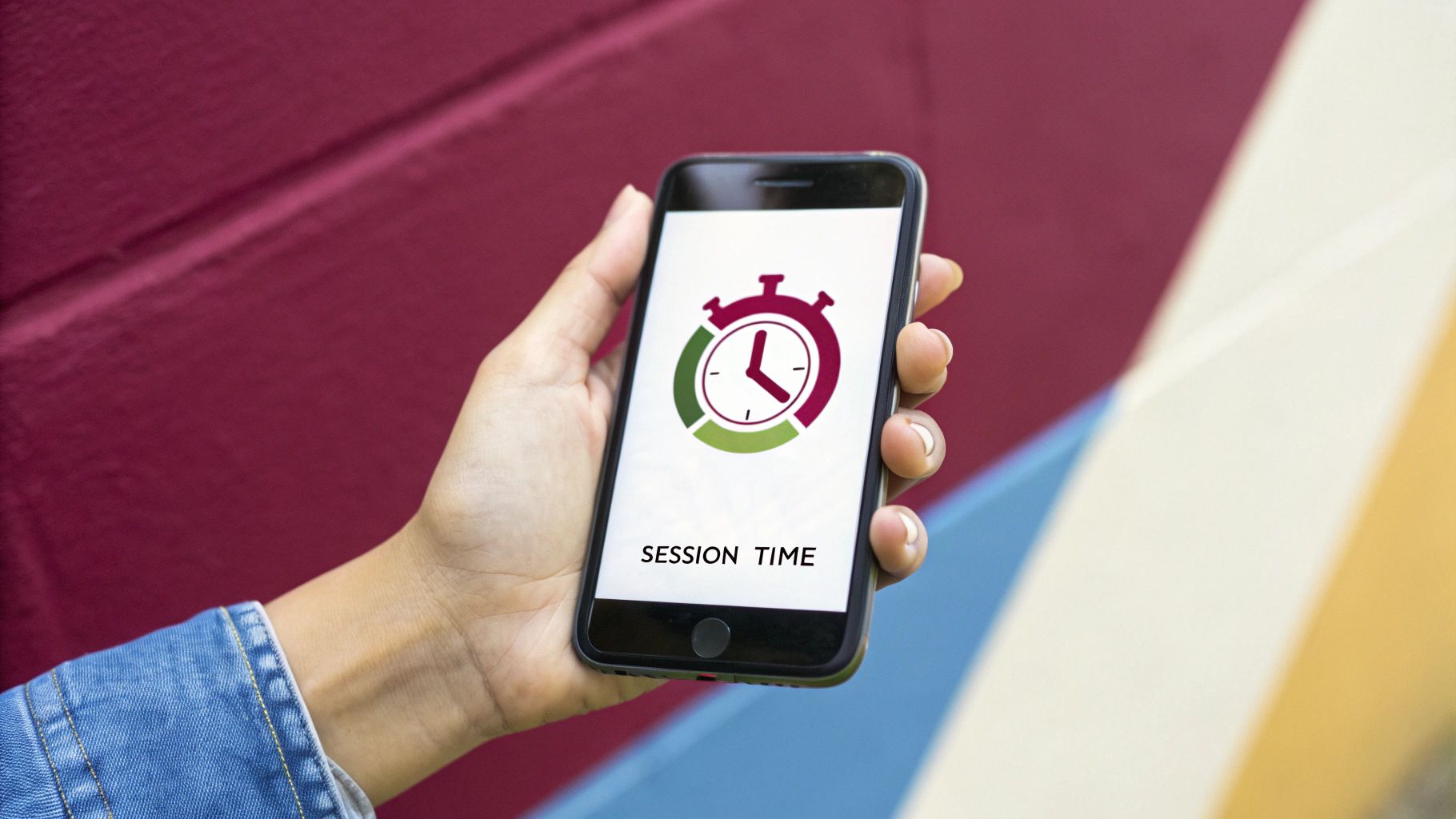
2. Session Duration
Session Duration is a crucial app engagement metric that measures the average amount of time users spend actively using your app during a single session. This period begins when the user opens the app and ends when they close it or switch to another application (backgrounding). Understanding session duration provides valuable insights into the “stickiness” of your app’s content and the depth of user engagement. Are users finding your app compelling enough to spend significant time within it, or are they bouncing quickly? This metric helps answer that question, making it a key component in evaluating app success and identifying areas for improvement.
Session duration is calculated by measuring the time elapsed between the app entering the foreground and moving to the background or being closed entirely. This data is then typically averaged across all users or segmented into specific user cohorts to reveal usage patterns within different demographics. The data is often presented as a mean, median, or distribution, providing a comprehensive view of user behavior. Most analytics platforms, including Mixpanel and Firebase, automatically track session duration, simplifying the data collection process for developers.
The benefits of tracking session duration are numerous. It goes beyond simple app opens and provides a more nuanced understanding of engagement quality. For instance, a high number of app opens coupled with short session durations might indicate a problem with the user experience or a lack of compelling content. Conversely, longer session durations suggest users are finding value and engaging deeply with the app’s features. This metric can also help pinpoint specific areas within the app that are capturing user attention versus those that are leading to quick exits. Ultimately, session duration serves as a strong predictor of user retention and lifetime value, making it a crucial metric for product managers and developers alike.
However, it’s important to be aware of the limitations of session duration. The metric can be skewed by users who unintentionally leave the app open in the background, artificially inflating the average. Additionally, optimal session duration varies drastically depending on the app category. A banking app, designed for quick transactions, will naturally have shorter sessions than a social media or gaming app. Furthermore, accurately measuring background app activity can be challenging, and the metric doesn’t distinguish between active user engagement and passive content consumption. A user might leave a podcast app open in the background, contributing to a long session duration, without actually interacting with the app.
Understanding these nuances is essential for proper interpretation. Consider these examples: TikTok boasts an average session duration of 52 minutes, a testament to its highly engaging content. Banking apps like Chase, focused on efficiency, target shorter sessions of 2-3 minutes. Gaming apps like Candy Crush strive for sessions in the 10-15 minute range to maximize ad revenue opportunities. These examples highlight how “optimal” session duration varies greatly across app categories.
For React Native developers, DevOps engineers, and product managers, understanding and optimizing session duration is particularly important. By tracking this metric alongside other app engagement indicators, you can gain a comprehensive understanding of user behavior and identify opportunities for improvement. Learn more about Session Duration and related application performance monitoring techniques.
Here are some actionable tips for effectively leveraging session duration data:
- Benchmark against competitors: Compare your app’s session duration against similar apps in your category to understand how you stack up against the competition. Tools like App Annie (now data.ai) provide valuable industry benchmarking data.
- Segment by feature: Track session duration for specific features or screens within your app. This granular approach can pinpoint which areas are driving engagement and which are causing users to disengage.
- Set up alerts: Configure alerts for significant drops in session duration. These alerts can serve as early warning signs of potential issues with the user experience or content quality.
- Correlate with user feedback: Combine session duration data with user satisfaction surveys and other qualitative feedback mechanisms to gain a more complete understanding of user engagement and identify areas for improvement. This combination of quantitative and qualitative data offers a more holistic view of user behavior.
By implementing these strategies, development teams can leverage session duration as a powerful tool for optimizing the user experience, improving content quality, and ultimately driving user retention and lifetime value. Remember to always consider the context of your app’s category and user base when interpreting and acting on session duration data.
3. Screen Flow and Navigation Patterns
Screen Flow and Navigation Patterns are a crucial app engagement metric that provides a dynamic view into how users interact with your application. Instead of simply measuring individual screen views, this metric focuses on the sequences and pathways users take as they navigate through your app. Understanding these patterns unveils valuable insights into user behavior, highlighting the most common routes, identifying areas of friction, and ultimately revealing opportunities to optimize the user experience and boost engagement. This metric goes beyond simple usage statistics and delves into the “why” behind user actions, providing a deeper understanding of the user journey.

This method works by tracking the sequence of screens a user visits within a session. Sophisticated analytics tools record these sequences, aggregate them, and visually represent them as flow diagrams or path analysis reports. These visualizations show the most frequent paths users take, the points where users drop off or exit the app, and the conversion rates between key screens. This data reveals patterns, such as common entry and exit points, cyclical navigation loops, and unexpected user behavior that deviates from the intended flow.
For React Native app developers, DevOps and release engineers, QA and beta testing teams, and security-conscious enterprise organizations, this information is invaluable. By understanding how users are actually using the app, development teams can pinpoint areas for improvement, optimize navigation flows, and enhance the overall user experience. Product managers seeking real-time insights can leverage this data to make informed decisions about feature prioritization and product roadmaps.
Here are a few examples of successful implementation of Screen Flow and Navigation analysis:
- E-commerce apps: Analyzing the flow from product browsing to adding to cart to checkout can identify drop-off points and optimize the purchase funnel, leading to increased conversion rates. Perhaps users are abandoning their carts due to a complicated checkout process or unexpected shipping costs.
- Gaming apps: Tracking the progression of users through different levels can reveal difficulty spikes or points where users are getting stuck. This allows developers to adjust the game balance and improve player retention.
- SaaS applications: Monitoring user navigation within a complex dashboard can highlight areas of confusion or underutilized features. This insight can guide UI/UX improvements and targeted onboarding efforts.
To effectively use screen flow analysis, consider these actionable tips:
- Focus on critical user journeys: Don’t try to track every possible path. Prioritize the key flows that are most important to your app’s success, such as the onboarding process, the purchase funnel, or core feature usage.
- Use heat mapping tools to complement flow data: Heatmaps visually represent user interaction with individual screens, revealing which elements are attracting the most attention and which are being ignored. This adds another layer of understanding to the flow data.
- Regularly review and act on identified friction points: Screen flow analysis shouldn’t be a one-time exercise. Regularly monitor the data to identify emerging trends, track the impact of changes, and continuously optimize the user experience.
- A/B test navigation changes based on flow insights: Once you’ve identified potential areas for improvement, use A/B testing to validate your hypotheses and ensure that changes to navigation or screen design actually lead to positive results.
While Screen Flow and Navigation Patterns offer valuable insights, they also come with certain limitations:
- Requires sophisticated analytics setup: Implementing robust screen flow tracking requires integrating specialized analytics tools and configuring them correctly.
- Can generate overwhelming amounts of data: Without proper filtering and focus, you can quickly become overwhelmed with data, making it difficult to extract meaningful insights.
- May not capture context behind user decisions: While flow data shows what users are doing, it doesn’t always explain why. User research and qualitative data can help fill this gap.
- Privacy considerations limit granular tracking: Balancing the need for granular data with user privacy is crucial. Ensure you are complying with all relevant privacy regulations and being transparent with users about data collection practices.
Screen flow and navigation analysis is a powerful tool for app engagement optimization. By understanding the pathways users take through your app, you can identify areas for improvement, streamline the user experience, and ultimately drive increased engagement and conversion rates. Learn more about Screen Flow and Navigation Patterns and explore platforms like Amplitude, Hotjar, and Adobe Analytics, popular choices for behavioral analytics and user experience insights, to help you leverage this valuable metric.
4. Feature Adoption Rate
Feature Adoption Rate is a critical app engagement metric that measures the percentage of users actively engaging with specific features within a defined timeframe. This metric provides valuable insights into feature performance, user behavior, and overall product success. By understanding which features resonate with users and which are underutilized, product teams can make data-driven decisions to improve the app experience, prioritize development efforts, and ultimately drive higher user engagement and retention. This makes it an essential metric for anyone involved in the app development lifecycle, from React Native developers and DevOps engineers to product managers and QA teams.

Calculating the Feature Adoption Rate is straightforward: (Users who used feature / Total users) × 100. This calculation can be applied to both newly introduced features and existing ones, allowing for continuous monitoring and optimization. Furthermore, tracking adoption rates over various time periods (daily, weekly, monthly) offers a granular view of feature usage trends. Segmenting these rates by user demographics or cohorts (e.g., new users vs. returning users) provides even deeper insights into how different user groups interact with specific features. This level of detail is particularly valuable for security-conscious enterprise organizations needing to understand how different user roles engage with security-related features.
The benefits of tracking Feature Adoption Rate are numerous. It directly measures the success of a feature and the value it delivers to users, guiding product development priorities. For instance, if a new feature designed to streamline a particular task has a low adoption rate, it signals a need for improvement or perhaps a different approach altogether. Conversely, high adoption rates validate successful features and can inform future development strategies. Identifying underutilized features allows for their potential removal, streamlining the app and reducing development overhead. This is especially important for React Native developers who strive for efficient and performant code. DevOps and release engineers can also benefit from this data, using it to prioritize deployments and optimize resource allocation.
Several real-world examples highlight the power of Feature Adoption Rate. Spotify’s Discover Weekly playlist, a personalized recommendation feature, achieved a remarkable 40% adoption rate within months of launch, demonstrating its strong user appeal. Instagram Stories, a feature allowing users to share ephemeral photo and video content, quickly reached a 70% daily adoption rate among active users, solidifying its place as a core component of the platform. Even seemingly smaller features can have a significant impact. Venmo’s social feed, which allows users to see their friends’ transactions, maintains a 60% monthly adoption rate, indicating its ongoing relevance and contribution to user engagement.
While Feature Adoption Rate is a powerful metric, it’s crucial to acknowledge its limitations. It may not fully capture feature discovery issues. A low adoption rate could be due to users simply not being aware of the feature’s existence rather than a lack of interest. It also doesn’t measure the quality of feature usage or user satisfaction. A high adoption rate doesn’t necessarily mean users are happy with the feature. Feature placement and design can also influence adoption rates. A prominently placed feature might have a higher adoption rate simply due to its visibility, not necessarily its inherent value. Finally, new features require sufficient time to gain traction, so it’s important to avoid premature conclusions based on initial adoption rates.
To maximize the effectiveness of tracking Feature Adoption Rate, consider the following tips:
- Set realistic adoption rate targets: These targets should be based on the feature’s type, purpose, and placement within the app.
- Track adoption rates alongside feature satisfaction scores: This provides a more holistic view of feature performance. Tools like Pendo can be invaluable for gathering user feedback and correlating it with adoption data.
- Improve feature discoverability: Utilize onboarding tutorials, tooltips, and in-app messaging to guide users towards new or underutilized features.
- Segment adoption rates by user demographics and cohorts: This helps identify specific user groups that are not engaging with certain features and tailor interventions accordingly.
- Use analytics tools: Leverage tools like FullStory to track detailed feature usage patterns and identify areas for improvement.
By understanding and effectively utilizing Feature Adoption Rate, app developers, product managers, and QA teams can gain valuable insights into user behavior, optimize the app experience, and ultimately drive greater app engagement and success. For product managers seeking real-time insights, this metric is crucial for making informed decisions about feature development and prioritization. By combining Feature Adoption Rate with other app engagement metrics, teams can create a comprehensive picture of app performance and make data-driven decisions to improve user satisfaction and business outcomes.
5. Push Notification Engagement
Push notification engagement is a critical app engagement metric that measures how effectively your app communicates with users outside of the app itself. It quantifies user interaction with push notifications, encompassing key indicators like open rates, click-through rates (CTR), and the subsequent actions users take within the app after interacting with a notification. For React Native app developers, DevOps engineers, and product managers, understanding and optimizing push notification engagement is paramount for driving user retention, promoting feature adoption, and ultimately, achieving app success. This metric deserves its place in the list of essential app engagement metrics because it provides a direct line of communication to re-engage users and encourage active usage.
Push notifications work by sending short messages directly to a user’s device, even when the app isn’t open. These messages can range from simple alerts to rich notifications containing images, videos, and interactive buttons. When a user receives a notification, they can choose to open it, leading them back into the app, or dismiss it. Tracking these interactions provides valuable insights into user behavior and preferences.
Push notification engagement is more than just sending messages; it’s about creating a meaningful dialogue with your users. This metric encompasses several key components:
- Open Rate: The percentage of delivered notifications that are opened by users. This provides a baseline understanding of how captivating your notification titles and content are.
- Click-Through Rate (CTR): The percentage of users who click on a link or button within the notification. This indicates how effectively your notification drives users to the intended in-app destination.
- Conversion Rate: The percentage of users who complete a desired action after clicking through the notification. This could be anything from making a purchase to completing a level in a game.
- Opt-in/Opt-out Rate: Tracking how many users enable or disable push notifications provides insights into user perception of your communication strategy. High opt-out rates can signal notification fatigue or irrelevant content.
- Notification Preferences: Understanding the types of notifications users prefer allows for more personalized and effective messaging.
Leveraging these components allows developers to create highly targeted and effective push notification campaigns. Learn more about Push Notification Engagement
Successful Implementations:
Several companies demonstrate the power of effective push notification engagement:
- Starbucks: Personalized offers and promotions sent via push notifications frequently achieve open rates exceeding 25%. By tailoring messages to individual user preferences and purchase history, Starbucks creates highly relevant and engaging content.
- Duolingo: The language learning app utilizes streak reminders and encouraging messages to maintain engagement rates of around 18%. These notifications tap into users’ desire for progress and consistency.
- News Apps (e.g., CNN): Breaking news alerts capitalize on the immediacy of push notifications, achieving click-through rates of 15-20%. These notifications provide timely and valuable information, driving users back to the app for details.
Actionable Tips for Developers:
- A/B Test: Experiment with different notification timings, frequencies, and messaging styles to identify what resonates best with your audience. A/B testing allows for data-driven optimization and continuous improvement.
- Segmentation: Divide your users into segments based on demographics, in-app behavior, and notification preferences. This allows for more targeted messaging and reduces the likelihood of notification fatigue.
- Rich Notifications: Incorporate images, videos, and interactive buttons to make your notifications more engaging and visually appealing. Rich notifications enhance the user experience and provide more options for interaction.
- Monitor Unsubscribe Rates: A rising unsubscribe rate is a strong indicator of notification fatigue. Pay close attention to this metric and adjust your strategy accordingly to prevent alienating users.
Pros and Cons:
Pros:
- Directly drives user re-engagement and retention
- Provides immediate feedback on messaging effectiveness
- Enables personalized communication strategies
- Cost-effective way to increase app usage
Cons:
- Over-messaging can lead to app uninstalls
- iOS and Android have different notification limitations
- Privacy regulations limit targeting capabilities
- Notification fatigue reduces effectiveness over time
When and Why to Use Push Notifications:
Push notifications are a powerful tool for a variety of purposes, including:
- Promoting New Features: Inform users about new updates and encourage adoption.
- Re-engaging Inactive Users: Remind users about the value your app provides and encourage them to return.
- Driving Conversions: Promote special offers, discounts, and limited-time deals.
- Delivering Time-Sensitive Information: Share breaking news, important updates, or personalized alerts.
Push notification engagement is a crucial metric for understanding how users interact with your app outside of its active use. By analyzing open rates, click-through rates, and other related metrics, developers can optimize their communication strategies, re-engage users, and ultimately drive app success. Tools like Urban Airship (now Airship), Braze, and OneSignal provide robust platforms for managing and analyzing push notification campaigns, offering valuable insights into user behavior and engagement patterns. By implementing the tips provided and carefully monitoring the pros and cons, push notifications can become a powerful tool for driving sustained growth and user satisfaction for your React Native application.
6. Cohort Retention Analysis
Cohort Retention Analysis is a powerful app engagement metric that goes beyond simple retention rates to provide a granular understanding of user behavior over time. It’s a crucial tool for React Native app developers, DevOps and release engineers, QA and beta testing teams, security-conscious enterprise organizations, and product managers seeking actionable insights to improve their app’s performance and long-term success. By grouping users into cohorts based on shared characteristics, typically their sign-up date, and tracking their engagement over time, Cohort Retention Analysis reveals valuable patterns and identifies factors that drive sustained app engagement. This depth of analysis justifies its place amongst the most crucial app engagement metrics.
Instead of just looking at the overall retention rate, cohort analysis allows you to see how specific groups of users behave over time. This segmentation is crucial because users acquired through different channels (e.g., social media ads, organic search, referrals) or during different time periods (e.g., seasonal campaigns, pre/post major app updates) may exhibit vastly different engagement patterns. For example, users acquired during a holiday promotion might have a higher initial engagement but lower long-term retention compared to users acquired organically.
How Cohort Retention Analysis Works:
The process involves segmenting users into cohorts and then tracking their activity over defined periods, typically days, weeks, or months. The analysis visualizes this data in a cohort retention table or chart, showing the percentage of users from each cohort who remain active over time. This visualization allows you to quickly identify trends, drop-off points, and differences in behavior between cohorts.
Features and Benefits of Cohort Retention Analysis:
- Grouping Flexibility: Cohort analysis allows for flexible grouping of users. You can segment by time periods (e.g., users who signed up in January 2024), acquisition channels (e.g., users acquired via Facebook Ads), or even specific behaviors (e.g., users who completed a tutorial). This flexibility provides targeted insights.
- Longitudinal Tracking: Tracking retention rates over extended periods reveals long-term engagement patterns and identifies factors contributing to sustained usage or churn.
- Visualization of Engagement Degradation: Cohort charts clearly visualize how engagement declines over time, pinpointing critical periods where intervention might be necessary.
- Inter-Cohort Comparison: Comparing different cohorts allows you to identify successful acquisition strategies, onboarding processes, or features that lead to higher long-term retention. This is particularly relevant for A/B testing different onboarding flows.
Pros:
- Predictive Insights: By analyzing cohort behavior, you can gain predictive insights into user lifetime value (LTV) and forecast future revenue.
- Optimized Acquisition Strategies: Identify which acquisition channels bring in users with the highest LTV and optimize your marketing spend accordingly.
- Improved Onboarding and UX: Pinpoint friction points in the early user experience by analyzing early retention drop-offs within cohorts and make data-driven improvements to your onboarding process.
- Identification of Temporal Patterns: Reveal seasonal or temporal engagement patterns that can inform marketing campaigns and product development.
Cons:
- Data Dependency: Meaningful cohort analysis requires significant historical data. New apps or those with limited user data may not benefit immediately.
- Complexity: Setting up and interpreting cohort analysis can be complex, requiring specialized tools and analytical expertise.
- Evolving User Behavior: User behavior can change over time due to external factors, making it essential to continuously monitor and adapt your analysis.
- External Influences: App updates, marketing campaigns, and even broader market trends can influence cohort behavior, requiring careful consideration when interpreting results.
Examples of Successful Implementation:
- WhatsApp: Maintains impressive Day 30 retention rates exceeding 70% across various user cohorts, demonstrating the power of focusing on user engagement.
- Clash of Clans: Uses cohort analysis to optimize player progression and identify points where players tend to drop off, allowing them to implement targeted interventions.
- Medium: Tracks content engagement retention by reader acquisition source to understand which channels drive the most engaged readership.
Actionable Tips for Implementation:
- Start Simple: Begin with time-based cohorts before introducing more complex segmentations. Focus on understanding the retention patterns of users who signed up during different periods.
- Prioritize Early Retention: Focus on early retention metrics (Day 1, 7, 30) to gain actionable insights into initial user experience and onboarding effectiveness.
- Comparative Analysis: Compare cohorts to identify successful strategies and features that drive higher long-term retention. Replicate these successful strategies across other cohorts.
- Inform Onboarding Improvements: Use cohort insights to identify friction points in the user onboarding flow and make data-driven improvements to enhance user engagement and retention.
Popularized By:
The importance of Cohort Retention Analysis has been highlighted by influential figures and methodologies, including Dave McClure’s AARRR (Pirate Metrics) framework and Eric Ries’s The Lean Startup methodology. Tools like Amplitude and Mixpanel provide robust platforms for conducting cohort analysis.
By leveraging Cohort Retention Analysis effectively, app developers and product managers can gain a deep understanding of user behavior, optimize their app’s performance, and ultimately drive long-term success. It’s a vital tool for understanding not just how many users are staying, but which users are staying and why. This level of granular insight makes cohort analysis an indispensable app engagement metric.
7. In-App Purchase Conversion Rate
In-App Purchase Conversion Rate (IAP Conversion Rate) is a critical app engagement metric that measures the percentage of users who make purchases within your app. This metric provides valuable insights into both the depth of user engagement and the effectiveness of your monetization strategy. Its importance is particularly pronounced for apps utilizing freemium or premium business models, where in-app purchases are a primary revenue driver. For React Native developers, DevOps engineers, and product managers alike, understanding and optimizing IAP Conversion Rate is essential for building a sustainable and profitable app.
This metric goes beyond simple downloads and daily active users. It delves into the core of user behavior, revealing how many users find enough value in your app to make a financial commitment. This information is crucial for justifying development efforts, prioritizing features, and ultimately, achieving business objectives.
How it Works and Why it Matters
IAP Conversion Rate is calculated by dividing the number of users who made a purchase by the total number of users, then multiplying the result by 100. This simple formula yields a percentage that represents the proportion of your user base willing to spend money within your app.
(Users who made purchases / Total users) × 100
This metric can be further segmented for deeper analysis. For example, you can track conversion rates by purchase type (e.g., one-time purchase vs. subscription), user demographics (e.g., age, location), or time periods (e.g., daily, weekly, monthly). This granular approach helps pinpoint specific user segments with higher or lower conversion rates, enabling targeted optimization efforts. For QA and beta testing teams, monitoring IAP Conversion Rate during testing phases can highlight potential issues within the purchase flow that might deter users.
Tracking IAP Conversion Rate alongside Average Revenue Per User (ARPU) provides a comprehensive view of monetization performance. While conversion rate shows how many users are making purchases, ARPU reveals how much each paying user is spending on average. These two metrics, when analyzed together, paint a more complete picture of your app’s revenue generation capabilities.
Examples of Successful Implementation:
Several successful apps have demonstrated the power of optimizing in-app purchase conversion rates:
- Candy Crush Saga: This popular mobile game maintains a 3-5% conversion rate among active players, highlighting the effectiveness of its freemium model and engaging gameplay loop.
- Spotify Premium: Spotify boasts a significantly higher conversion rate, converting approximately 25% of free users to paid subscriptions. This success can be attributed to the value proposition of ad-free listening and offline playback.
- Headspace: This meditation app achieves a 10-15% conversion from free trial to paid subscription, showcasing the effectiveness of offering a compelling trial experience and clear value proposition.
Actionable Tips for Optimization:
For React Native app developers and DevOps engineers, optimizing the purchase flow is a key area of focus. A smooth and intuitive checkout experience can significantly impact conversion rates. Here are some practical tips for maximizing your IAP Conversion Rate:
- Optimize the purchase flow: Minimize the number of steps required to complete a purchase. Reduce friction by streamlining the checkout process and ensuring a seamless user experience.
- Test different price points and purchase options: Experiment with various pricing strategies and offer different purchase options (e.g., one-time purchase, subscription tiers) to identify the optimal configuration for your target audience.
- Use limited-time offers and personalization: Create a sense of urgency with limited-time discounts and promotions. Leverage user data to personalize offers and recommendations, increasing their relevance and appeal.
- Track conversion rates by traffic source: Analyze conversion rates based on where users are coming from (e.g., social media, app store search). This data helps optimize acquisition spending by focusing on channels that deliver high-converting users.
Pros and Cons:
Pros:
- Directly measures monetization success and user value perception
- Indicates strong user engagement and app utility
- Enables optimization of pricing and purchase flows
- Provides insights into user willingness to pay
Cons:
- Only relevant for apps with monetization features
- Can be influenced by external economic factors
- May not reflect user satisfaction with purchases
- Platform fees (App Store, Google Play) affect actual revenue
For security-conscious enterprise organizations, understanding the potential impact of platform fees on actual revenue is critical. While IAP Conversion Rate provides a valuable measure of user engagement and monetization potential, it’s important to remember that these fees will impact the bottom line.
In conclusion, In-App Purchase Conversion Rate is a pivotal metric for app success, especially for those relying on in-app purchases for revenue. By understanding how it works, analyzing successful examples, and implementing the provided tips, you can effectively optimize your monetization strategy, enhance user engagement, and drive the growth of your app. For the target audience of React Native developers, DevOps and release engineers, QA and beta testing teams, security-conscious enterprise organizations, and product managers, this metric provides invaluable insights into the financial health and user engagement depth of their applications.
8. App Store Rating and Review Sentiment
App Store Rating and Review Sentiment is a crucial app engagement metric that provides valuable insights into user satisfaction and areas for improvement within your app. It goes beyond simple download numbers and delves into the why behind user behavior, offering a qualitative dimension to your quantitative data. This metric directly influences your app store visibility, impacting both search rankings and potential users’ download decisions. It deserves a place on this list because it represents the voice of your users, offering a direct line to understanding their experiences and shaping future development. For React Native developers, DevOps and release engineers, QA and beta testing teams, security-conscious organizations, and product managers, understanding and actively monitoring this metric is paramount for building successful and engaging apps.
This metric analyzes user feedback, ratings (typically on a scale of 1 to 5 stars), and written reviews across various app stores like the iOS App Store, Google Play Store, and others. By aggregating this data, you gain a comprehensive overview of user perception. Modern tools leverage Natural Language Processing (NLP) to dissect the sentiment expressed within reviews, categorizing them as positive, negative, or neutral. This allows for a deeper understanding of the underlying emotions and opinions driving the ratings. Tracking rating trends over time, especially in relation to app version releases, helps pinpoint the impact of updates and new features on user satisfaction. Identifying common themes and keywords in user feedback through NLP helps prioritize bug fixes and feature development, ensuring you’re addressing the most impactful issues for your users.
For instance, Instagram maintains a 4.5+ star rating across app stores by proactively addressing user issues and responding to feedback. This positive sentiment contributes significantly to their continued visibility and user acquisition. Conversely, Robinhood experienced a significant drop in ratings during periods of trading outages, directly impacting user acquisition and highlighting the tangible consequences of negative user experiences. Headspace, a popular meditation app, effectively utilizes review feedback to prioritize the development of new meditation content, ensuring they are meeting the evolving needs of their user base.
Leveraging this metric effectively requires a multi-faceted approach. Several tools, including those popularized by industry leaders like App Annie (data.ai) for app store analytics, Sensor Tower for competitive app intelligence, and AppFollow for review management and monitoring, facilitate this process. They aggregate ratings from different platforms, perform sentiment analysis, track rating trends, and even provide alerts for significant changes. These tools can be invaluable for staying on top of user sentiment and reacting proactively to emerging issues.
Here are some actionable tips for leveraging App Store Rating and Review Sentiment:
- Respond promptly and professionally to negative reviews: Addressing concerns publicly shows users you value their feedback and are actively working to improve the app.
- Use in-app prompts to encourage reviews from satisfied users: Timing is key. Prompt users for reviews after they’ve completed a key action or experienced value within your app.
- Track sentiment changes after app updates or new features: This helps identify whether changes have the desired positive impact or if they inadvertently introduce new issues.
- Implement feedback loops between review insights and product development: Make user feedback an integral part of your product roadmap. Prioritize development based on the most pressing issues and desired features identified in reviews.
- Segment your analysis: Look at sentiment trends across different user demographics to identify specific pain points for particular groups.
While App Store Rating and Review Sentiment is a powerful metric, it also has limitations. It can be biased towards extreme experiences, with users more likely to leave reviews after very positive or very negative interactions. It may not represent the silent majority of users who don’t leave reviews. The system is also susceptible to fake reviews and manipulation, which can skew the data. Furthermore, response rates can vary significantly across different user demographics, making it important to consider the representativeness of your data.
Despite these limitations, the insights gained from analyzing App Store Rating and Review Sentiment are invaluable for understanding user perception, improving your app, and ultimately driving success in the competitive app market. By actively monitoring and responding to user feedback, you can build a stronger, more engaging app that resonates with your target audience. Learn more about App Store Rating and Review Sentiment to delve deeper into the strategies and tools available for effectively utilizing this important metric.
App Engagement Metrics Comparison
| Metric | Implementation Complexity 🔄 | Resource Requirements ⚡ | Expected Outcomes 📊 | Ideal Use Cases 💡 | Key Advantages ⭐ |
|---|---|---|---|---|---|
| Daily Active Users (DAU) | Low - basic unique user tracking | Low - unique IDs or accounts | Real-time daily engagement insight | Monitoring app health, user retention | Easy to track; immediate feedback; foundational metric |
| Session Duration | Medium - tracking session start/end events | Medium - accurate timing data | Measures depth of engagement and content stickiness | UX optimization, retention prediction | Indicates engagement quality; actionable for UX |
| Screen Flow & Navigation | High - requires sophisticated path tracking | High - advanced analytics tools | Reveals user journey, drop-offs, and bottlenecks | UX design, funnel analysis, journey optimization | Actionable UX insights; identifies friction points |
| Feature Adoption Rate | Medium - track specific feature use | Medium - segmented event tracking | Measures feature success and user value | Product development prioritization | Direct measure of feature impact and user value |
| Push Notification Engagement | Medium - track clicks, opens, opt-in rates | Medium - messaging infrastructure | Optimizes user re-engagement and messaging effectiveness | Communication strategy, retention | Drives re-engagement; personalized messaging |
| Cohort Retention Analysis | High - complex grouping and long-term tracking | High - extensive historical data | Deep insights on user behavior and lifetime value | Long-term retention, acquisition strategy assessment | Predictive retention understanding; user segmentation |
| In-App Purchase Conversion Rate | Medium - track purchase completions | Medium - sales and user data | Monetization effectiveness and user willingness to pay | Freemium and premium app revenue optimization | Direct monetization metric; guides pricing strategy |
| App Store Rating & Review Sentiment | Medium - aggregates reviews and sentiment analysis | Medium - NLP tools and data sources | User satisfaction insight and app store visibility | Quality assurance, marketing impact analysis | Direct user feedback; impacts downloads and reputation |
Putting It All Together: A Data-Driven Approach to App Success
Mastering app engagement metrics is crucial for understanding user behavior and driving app success. From Daily Active Users (DAU) and session duration to push notification engagement and in-app purchase conversion rates, these eight key metrics provide a comprehensive view of your app’s performance. By analyzing screen flow, feature adoption, and cohort retention, you can identify areas for improvement in user experience and tailor your product roadmap to meet user needs. Furthermore, monitoring app store ratings and review sentiment provides invaluable feedback directly from your users, allowing you to address concerns and build a stronger product. This data-driven approach, incorporating the analysis of vital app engagement metrics, empowers you to make informed decisions about product development, marketing strategies, and overall app optimization, ultimately leading to increased user satisfaction, retention, and business growth.
The insights derived from these app engagement metrics are not just numbers; they represent the voice of your users and the pulse of your app. By actively listening to this data, you can anticipate user needs, personalize their experience, and build a thriving app community. This proactive approach, fueled by data, is essential for staying competitive in today’s dynamic mobile landscape.
Ready to transform your app’s performance with data-driven insights? CodePushGo empowers you to rapidly release updates based on your analysis of these key app engagement metrics, ensuring you can quickly adapt to user feedback and market trends. Visit CodePushGo today to learn more and start optimizing your app for success.