Building a beautiful, high-performance mobile app requires more than just clean code; it demands a solid UI foundation. A React Native UI library can dramatically accelerate development, ensure design consistency, and improve the user experience. But with dozens of options available, from comprehensive component kits to flexible styling systems, choosing the right one can be a project in itself. The wrong choice can lead to performance bottlenecks, maintenance headaches, or a disjointed user interface that fails to impress.
This guide cuts through the noise. We provide a detailed, developer-focused comparison of the top libraries and resources you need to consider. We move beyond simple feature lists to analyze each tool’s core philosophy, practical use cases, and potential limitations. This deep dive will help you make an informed decision that aligns with your project’s specific goals, whether you’re building a design system from scratch with a tool like Tamagui or need a ready-made component kit like React Native Paper to ship features faster.
Each entry includes screenshots, direct links, and a clear breakdown of pros and cons, empowering you to select the best React Native UI library for your next application efficiently. Let’s explore the options that will help you build polished, professional apps.
1. React Native Paper
React Native Paper is a cross-platform, production-ready React Native UI library that strictly follows Google’s Material Design guidelines. Maintained by the expert team at Callstack, it provides a comprehensive suite of customizable and accessible components. This library is an excellent choice for developers who want to achieve a consistent, modern Android look and feel across both iOS and Android platforms with minimal effort. Its commitment to the Material You (Material Design 3) theming engine makes it particularly relevant for contemporary app development.
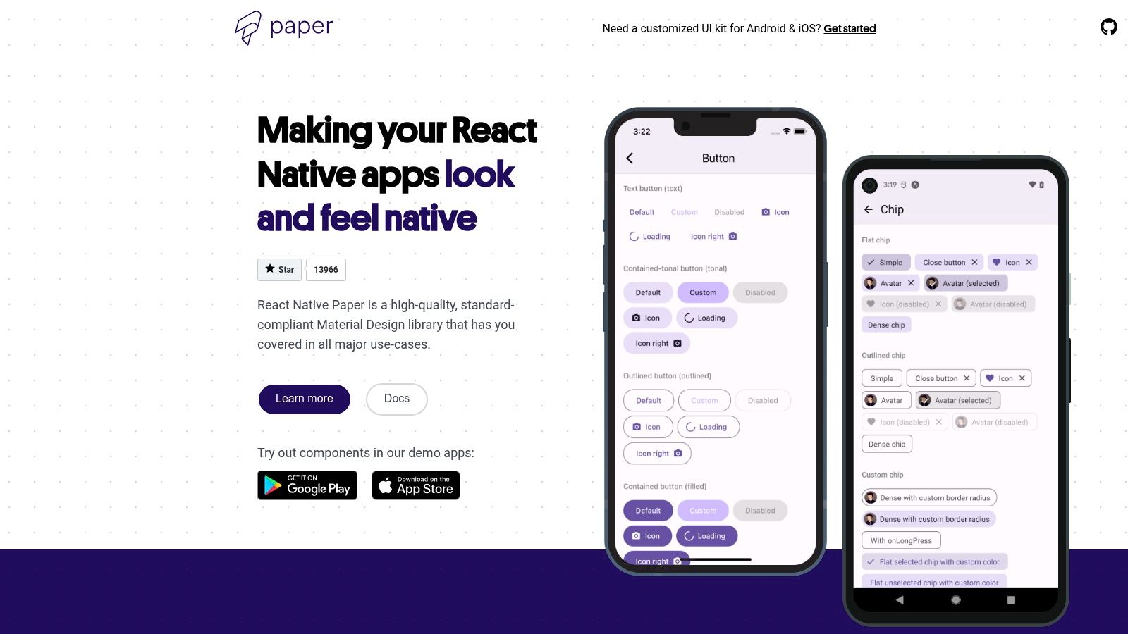
The library excels with its powerful theming capabilities, allowing you to define a central theme object with custom colors, fonts, and component styles that cascade throughout your application. This makes implementing features like dark mode incredibly straightforward.
Key Features and Implementation
React Native Paper is free and open-source, making it accessible to all developers. Its documentation is thorough, providing clear usage examples and props for each component.
| Feature | Description |
|---|---|
| Component Library | Offers over 30 components, including Button, Card, Dialog, and DataTable. |
| Theming System | Full support for Material Design 3 (Material You) theming, including dynamic colors and dark mode. |
| Accessibility | Strong support for screen readers, keyboard navigation, and Right-to-Left (RTL) languages out of the box. |
| Installation | Straightforward setup with npm or yarn. |
Using npm
npm install react-native-paper
Using yarn
yarn add react-native-paper
Pros:
- Consistent and high-quality components maintained by React Native experts.
- Excellent documentation with live demos on the official website.
- Strong accessibility and RTL support are built-in.
Cons:
- Its strong adherence to Material Design may require significant customization if your brand identity is drastically different.
Website: https://reactnativepaper.com
2. NativeBase (transitioning to gluestack-ui)
NativeBase has long been a go-to React Native UI library for developers seeking a versatile and highly customizable component suite that works seamlessly across iOS, Android, and the web. Its key strength lies in its utility-first props, inspired by frameworks like Tailwind CSS, which allow for rapid styling directly on components. Although the library is now in maintenance mode, its mature ecosystem and extensive documentation still make it a relevant resource.
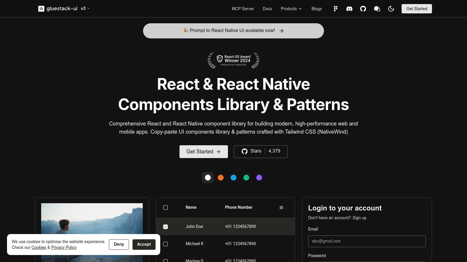
The project’s creators are now focusing on gluestack-ui, a more modern, unstyled, and performance-oriented successor. However, NativeBase remains a powerful tool, especially for maintaining existing applications. Its focus on accessibility, powered by React Native ARIA, ensures that applications are usable by a wider audience. The team provides a clear migration path for developers looking to transition from NativeBase to the newer gluestack-ui.
Key Features and Implementation
NativeBase is free, open-source, and has a large community, offering a wealth of shared knowledge. Its KitchenSink app provides a comprehensive demo of all available components.
| Feature | Description |
|---|---|
| Component Library | A large set of over 40 components, including Box, Button, Icon, and form elements. |
| Styling System | Utility-first props for inline styling and a powerful theming API for global design tokens. |
| Accessibility | Strong accessibility support through its integration with React Native ARIA for hooks and components. |
| Installation | Straightforward setup with npm or yarn, with providers needed at the root of your application. |
Using npm
npm install native-base
Using yarn
yarn add native-base
Pros:
- Mature and stable library with a large, supportive community.
- Excellent cross-platform consistency between mobile and web.
- Powerful utility-prop system simplifies the styling process.
Cons:
- Now in maintenance mode, with active development shifted to its successor, gluestack-ui.
- New projects are officially encouraged to start with gluestack-ui instead.
Website: https://nativebase.io
3. React Native Elements (RNE UI)
React Native Elements is a community-driven, cross-platform React Native UI library that prioritizes ease of use and developer experience. It provides a foundational kit of over 30 essential components, making it an ideal choice for developers looking to quickly prototype or build applications without being tied to a rigid design system. Its components offer a more generic, unopinionated look that can be easily customized to fit any brand identity, serving as a solid starting point for any project.
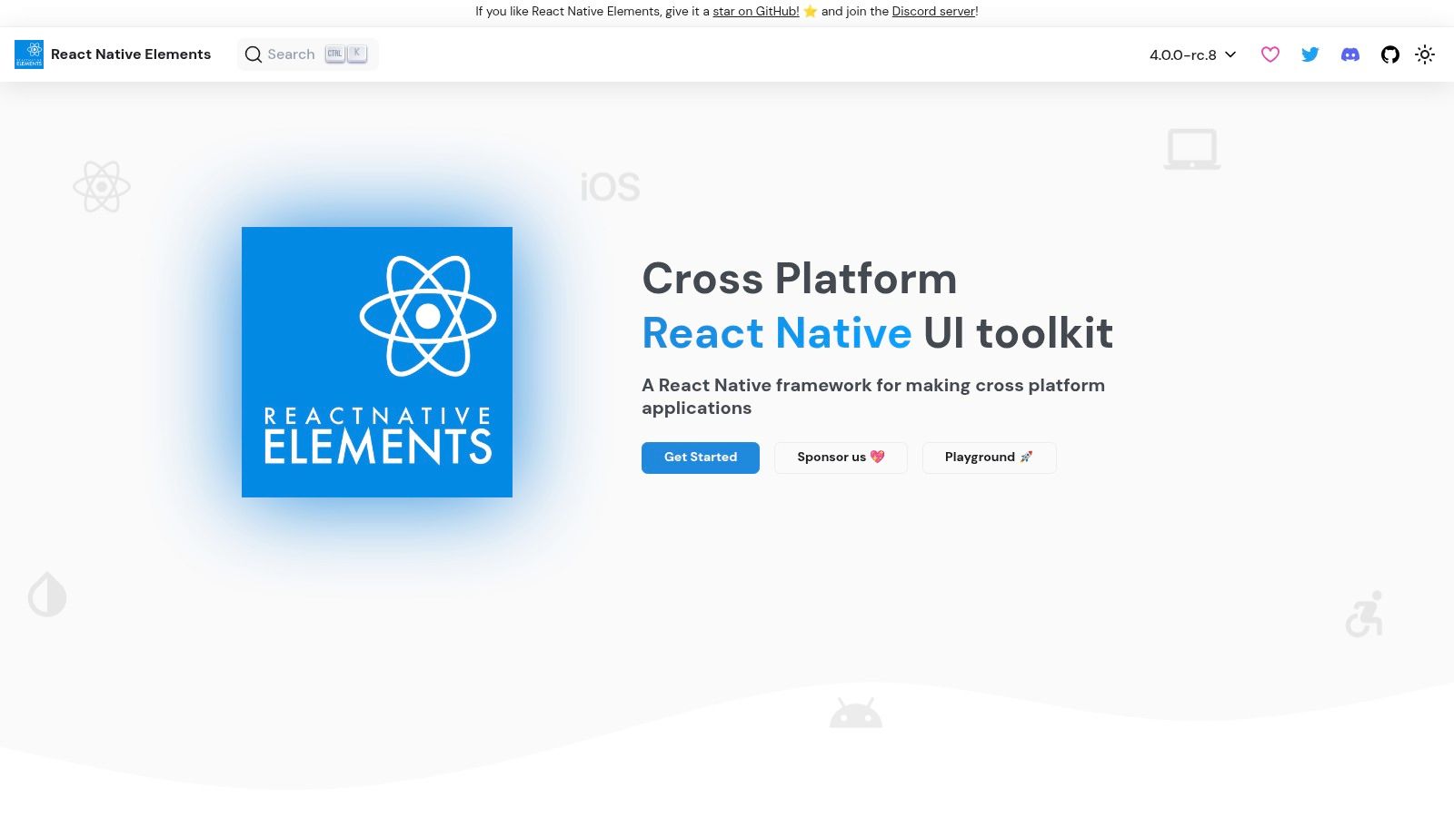
The library’s strength lies in its simple, prop-based API and excellent TypeScript support, which streamlines the development process. With clear documentation and dedicated Expo demo applications, getting started and exploring component capabilities is incredibly straightforward for developers of all skill levels.
Key Features and Implementation
React Native Elements is completely free and open-source, supported by an active community. Its documentation is beginner-friendly and includes practical examples that can be directly integrated into projects.
| Feature | Description |
|---|---|
| Component Library | Offers core components like Avatar, Badge, Button, Card, and SearchBar. |
| Theming System | Provides a simple theming API for customizing colors, fonts, and component styles globally. |
| Platform Support | Components are designed to work seamlessly across iOS, Android, and Web platforms. |
| Installation | Simple installation process via npm or yarn, with optional vector icons setup. |
Using npm
npm install @rneui/themed @rneui/base
Using yarn
yarn add @rneui/themed @rneui/base
Pros:
- Friendly and intuitive API makes it easy for beginners to get started quickly.
- Active community support, including a dedicated Discord channel for assistance.
- Highly customizable components that aren’t locked into a specific design system.
Cons:
- Offers a smaller set of components compared to more comprehensive, design-system-first libraries.
Website: https://reactnativeelements.com
4. Wix React Native UI Lib (RNUILib)
Wix React Native UI Lib, often called RNUILib, is a powerful and extensive React Native UI library for building stunning applications. Developed and battle-tested by the engineering team at Wix, this library is particularly well-suited for product teams looking to create and maintain a standardized, custom design system. It provides a comprehensive set of UI primitives and ready-to-use components that are both highly configurable and performant.
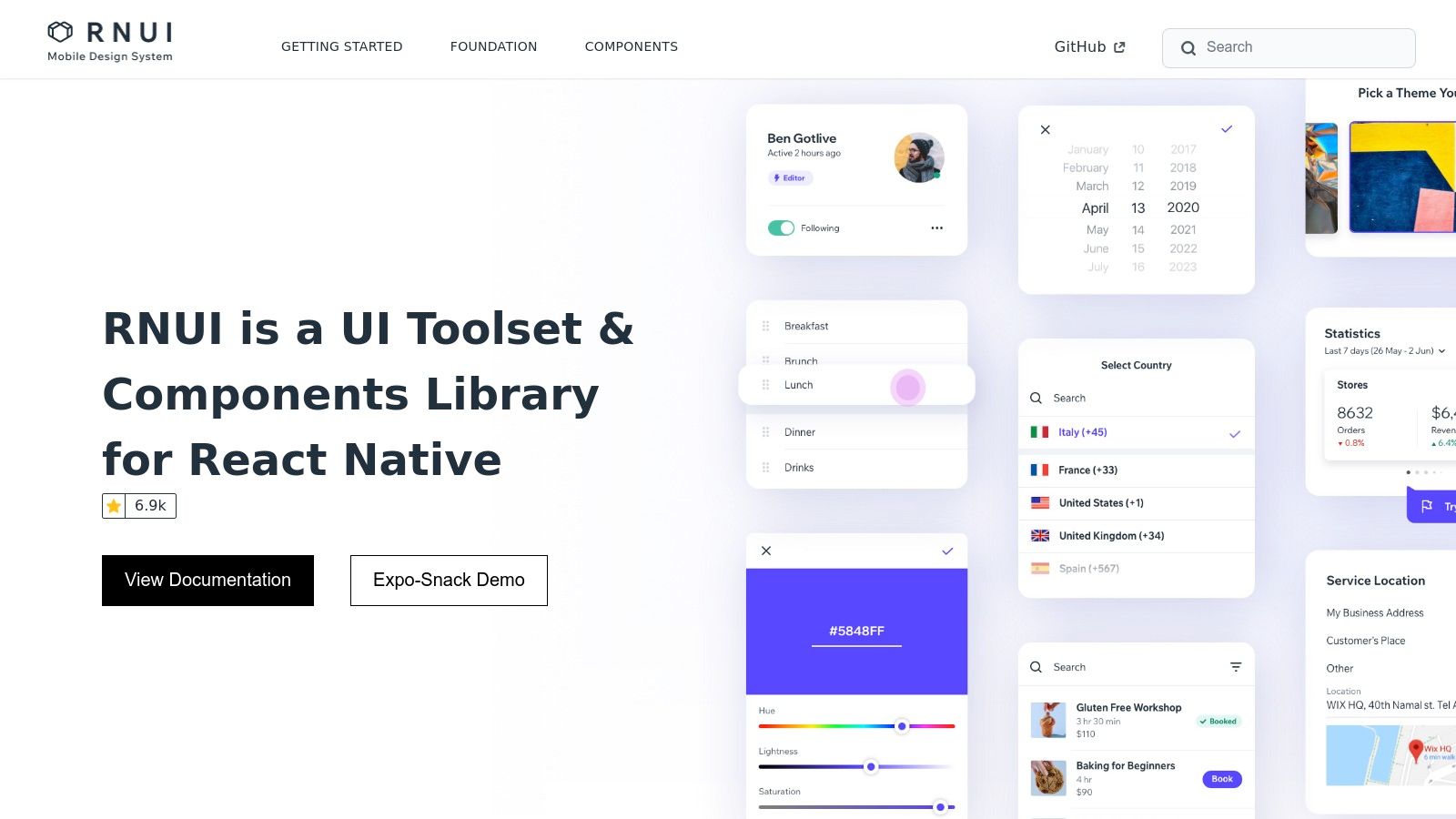
The library’s core strength lies in its design-system-first approach, offering robust theming capabilities for colors, typography, and spacing. This foundation allows developers to enforce brand consistency across large-scale projects. When complex component behaviors lead to unexpected issues, having solid strategies for debugging React Native is essential to maintain development velocity.
Key Features and Implementation
RNUILib is completely free and open-source, with a detailed website that includes an Expo demo app to showcase its components in action. The documentation is thorough, guiding developers through setup and customization.
| Feature | Description |
|---|---|
| Component Library | A rich collection of over 60 components, including Card, ConnectionStatusBar, and WheelPicker. |
| Theming System | Provides theming primitives (colors, typography, spacing) and a Component Theming API for deep control. |
| Design System Focus | Built with modifiers for a streamlined, props-based styling workflow that promotes design consistency. |
| Installation | Simple installation process using standard package managers. |
Using npm
npm install react-native-ui-lib
Using yarn
yarn add react-native-ui-lib
Pros:
- Backed by Wix and used in their production applications, ensuring reliability.
- Excellent for teams creating a unique and standardized design system.
- Highly customizable components and a powerful theming engine.
Cons:
- Its opinionated patterns and modifier-based styling may have a learning curve for new developers.
- The initial setup and configuration can feel more complex than in simpler libraries.
Website: https://wix.github.io/react-native-ui-lib/
5. UI Kitten (by Akveo)
UI Kitten is a design-system-based React Native UI library that leverages the powerful Eva Design System for remarkable theming capabilities. Developed by Akveo, it enables developers to create stunning, brand-consistent applications with ease. The core philosophy of UI Kitten is to provide a solid set of customizable components that can be visually configured on the fly, making it a strong choice for projects that require deep branding and dynamic theme switching.
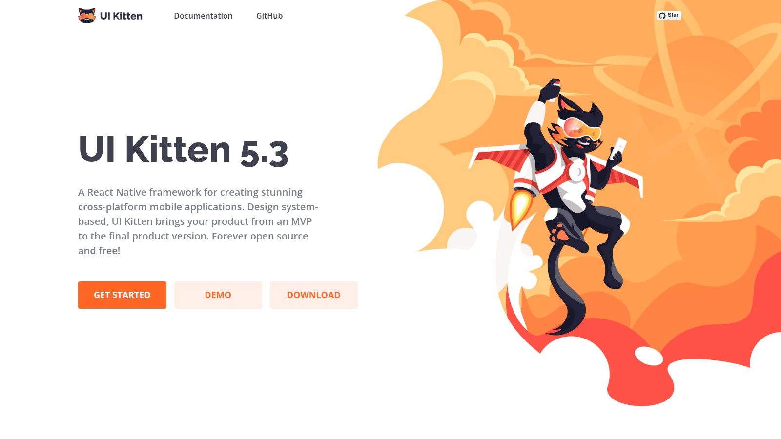
Its standout feature is the ability to change themes at runtime without reloading the application, a significant advantage for implementing features like user-selectable light and dark modes. This functionality is baked into its architecture, setting it apart from libraries where theming can feel like an afterthought.
Key Features and Implementation
UI Kitten is completely free and open-source. The library also integrates smoothly with the Eva Icons pack, providing a consistent visual language across your application’s components and iconography.
| Feature | Description |
|---|---|
| Component Library | Includes over 20 essential components like Button, Input, Card, and Menu. |
| Theming System | Offers hot-swappable theming with pre-built light and dark themes based on the Eva Design System. |
| Icon Integration | Seamlessly integrates with Eva Icons, supporting SVG, animations, and various formats. |
| Installation | Simple installation process using npm or yarn, with a few peer dependencies for icons and SVG. |
Using npm
npm i @ui-kitten/components @eva-design/eva react-native-svg
Using yarn
yarn add @ui-kitten/components @eva-design/eva react-native-svg
Pros:
- Excellent runtime theming capabilities perfect for custom branding.
- Helpful starter app templates illustrate usage patterns effectively.
- Strong integration with the Eva Design System and Eva Icons.
Cons:
- The component set is smaller compared to more extensive libraries.
- Its update frequency can sometimes vary.
Website: https://akveo.github.io/react-native-ui-kitten/
6. Tamagui
Tamagui is a unique and powerful React Native UI library and style system designed for performance across both native and web platforms. It stands out by using an optimizing compiler that flattens style and component trees at build time, resulting in significantly faster runtime performance. This innovative approach makes it a top choice for developers building high-performance, universal applications who need a scalable design system that works seamlessly from low-level primitives to a full UI kit.
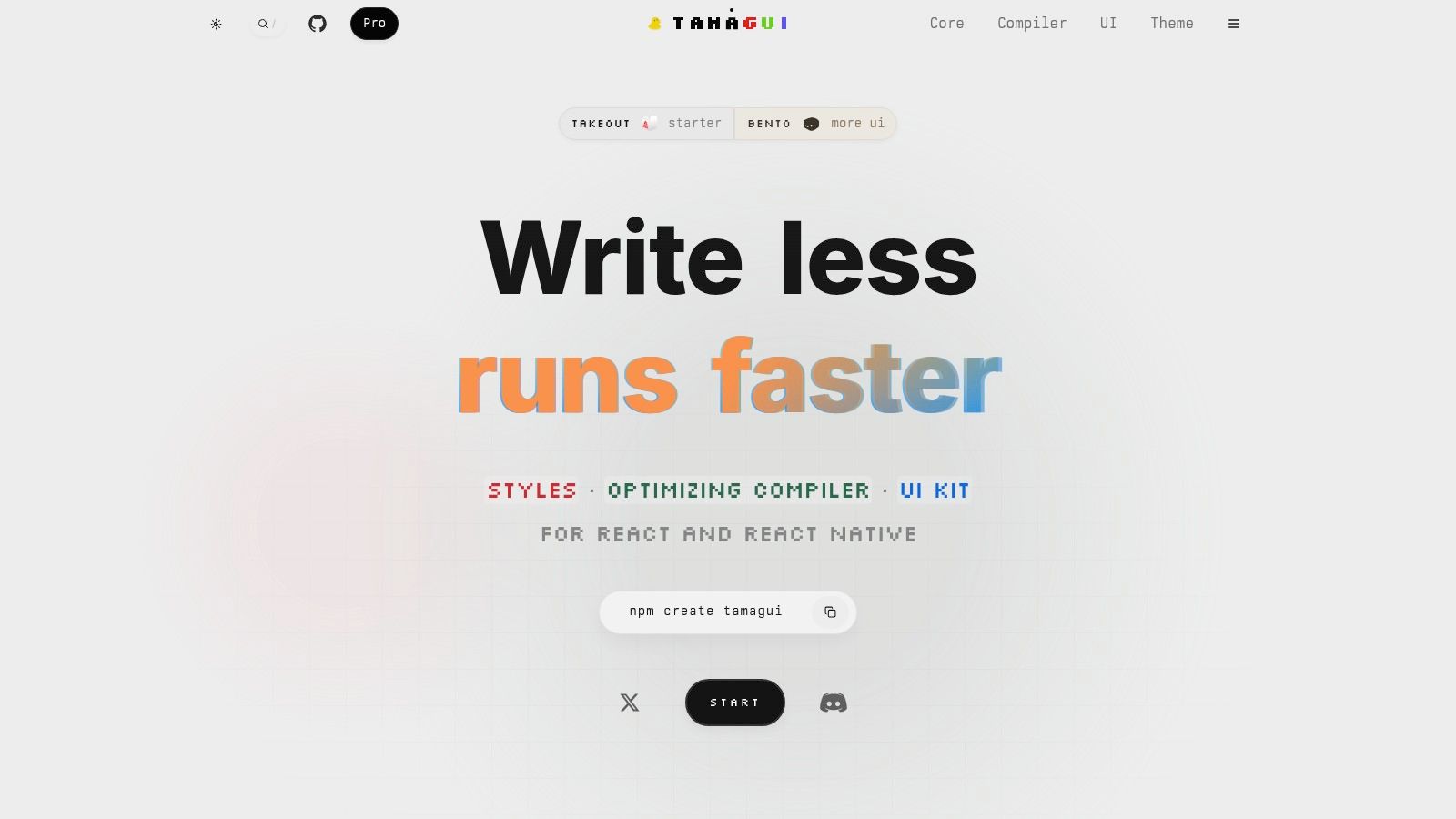
The library provides a comprehensive set of unstyled primitives and an optional, beautifully designed UI kit called tamagui. This dual offering gives developers the flexibility to build a completely custom design system from the ground up or start quickly with a pre-built set of components. Its focus on performance and creating a unified codebase for both mobile and web makes it a forward-thinking choice. If you’re interested in performance-centric approaches, you can learn more about building apps with React Native on codepushgo.com.
Key Features and Implementation
Tamagui is open-source and provides extensive documentation and starter kits to get developers up and running quickly. The create-tamagui CLI tool simplifies project setup for universal apps.
| Feature | Description |
|---|---|
| Optimizing Compiler | Flattens the component tree at build time to dramatically improve load and runtime performance. |
| Universal Components | Write-once components that render optimally on React Native, web, and server-side rendering. |
| Scalable System | Includes low-level primitives (Stacks, Text) and a full, optional UI kit with themes. |
| Installation | Setup is streamlined with a CLI tool for creating new universal or native-only projects. |
Using npm
npm create tamagui@latest
Using yarn
yarn create tamagui
Pros:
- Exceptional performance due to its innovative optimizing compiler.
- Truly universal, enabling a single design system for both web and native platforms.
- Highly scalable, from basic style primitives to a complete UI component library.
Cons:
- Requires more upfront configuration and a deeper understanding of its architecture compared to simpler UI kits.
Website: https://tamagui.dev
7. Dripsy
Dripsy is an unstyled, theme-based React Native UI library designed for developers who need to build a completely custom design system from the ground up. Instead of providing pre-styled components, it offers a set of primitive, responsive building blocks that work seamlessly across both React Native and the web (with Next.js). This approach is ideal for teams that want to enforce design consistency through a centralized theme, giving them full control over their application’s look and feel without fighting against default styles.
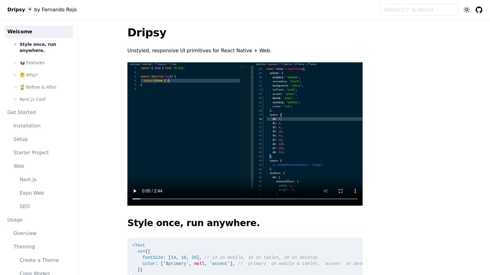
The library’s core strength lies in its responsive styling API, which uses a simple array syntax to define styles for different breakpoints. This makes creating adaptive UIs that look great on any screen size remarkably intuitive. Its lightweight nature and minimal abstractions ensure high performance, while its strong TypeScript support enhances the developer experience.
Key Features and Implementation
Dripsy is a free, open-source tool that prioritizes developer control and a theme-first methodology. Its documentation is clear and focused on getting you started with building your own component library.
| Feature | Description |
|---|---|
| Theme-Based Primitives | Provides unstyled components like View, Text, and Image that are driven by a theme object. |
| Responsive API | Implements responsive designs using an intuitive array syntax for props, like fontSize={[1, 2, 3]}. |
| Cross-Platform | Components and styles work consistently across React Native, iOS, Android, and web (Next.js). |
| Installation | Simple setup via npm or yarn, with excellent Expo and TypeScript compatibility. |
Using npm
npm install dripsy
Using yarn
yarn add dripsy
Pros:
- Extremely lightweight with minimal abstractions, offering great performance.
- Enforces design consistency through a powerful, centralized theming system.
- Excellent for building truly custom, cross-platform design systems.
Cons:
- Not a good fit for teams wanting pre-built, ready-to-use components as it provides none.
Website: https://dripsy.xyz
8. Shopify Restyle
Shopify Restyle is not a traditional component library but rather a powerful, type-safe system for building theme-aware UI components in React Native. Developed and battle-tested by Shopify, this React Native UI library provides a set of utilities and primitives for creating your own design system from the ground up. It is the ideal choice for teams that require a custom, branded component library and want to enforce consistency and type safety through TypeScript.
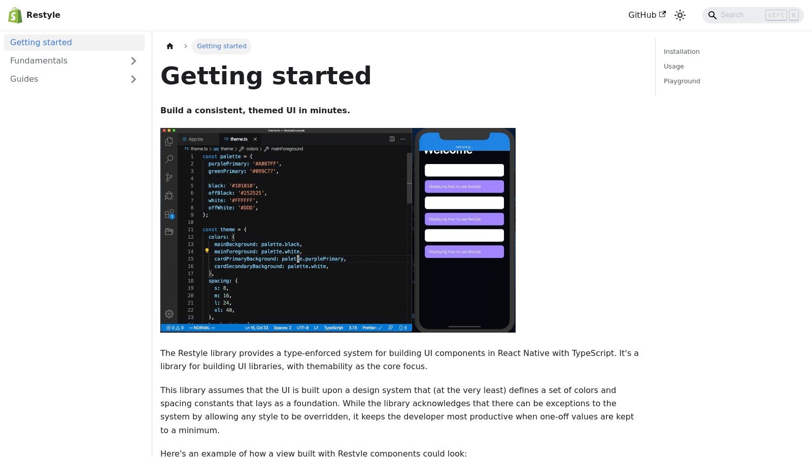
The library’s core strength lies in its excellent TypeScript integration, which ensures that all styling props (like colors, spacing, and variants) are derived directly from your theme object. This eliminates guesswork and runtime errors, leading to a much smoother developer experience when building or maintaining a custom component set.
Key Features and Implementation
Shopify Restyle is completely free and open-source. Its primary value is in providing the foundational tools for building a bespoke, themeable UI layer rather than offering pre-built components.
| Feature | Description |
|---|---|
| Type-Safe Theming | Automatically generates TypeScript types from your theme configuration for props like color, spacing, and variant. |
| Style Primitives | Offers style functions for layout, color, typography, and more, allowing you to create components with shorthand style props. |
| Flexibility | Provides the building blocks to create a custom design system, not a restrictive set of pre-designed components. |
| Installation | Simple setup via npm or yarn, requiring only a theme definition to get started. |
Using npm
npm install @shopify/restyle
Using yarn
yarn add @shopify/restyle
Pros:
- Excellent type safety improves developer experience and reduces bugs.
- Backed and maintained by Shopify, ensuring production-grade quality.
- Highly flexible, allowing for the creation of a completely custom design system.
Cons:
- It is a toolset, not a component library; you must build all your UI components yourself.
Website: https://shopify.github.io/restyle
9. React Native Directory
While not a React Native UI library itself, React Native Directory is an indispensable resource for discovering them. It serves as a comprehensive, community-maintained catalog of nearly every package available for React Native development. This platform allows developers to search, filter, and compare libraries based on crucial metrics like platform compatibility (iOS, Android, Web), Expo Go support, and GitHub activity, making it the definitive starting point for finding the perfect UI toolkit for any project.
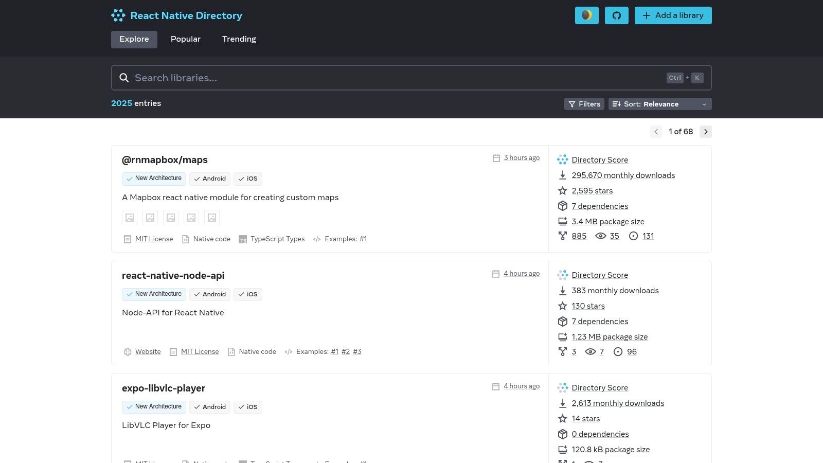
The directory excels by aggregating vital health and popularity metrics, such as GitHub stars, open issues, and last update time. This data provides a quick, at-a-glance assessment of a library’s maintenance status and community adoption, helping you avoid outdated or abandoned packages. For anyone looking to compare different UI component libraries, this is the most efficient tool available.
Key Features and Implementation
React Native Directory is a free-to-use public website. While it doesn’t require installation, its public API allows for programmatic access to its vast dataset, which can be integrated into custom developer workflows or tools.
| Feature | Description |
|---|---|
| Search & Filtering | Powerful filters for platforms (iOS, Android, Web, etc.), Expo Go compatibility, and categories like UI. |
| Health Metrics | Displays GitHub stars, open issues/PRs, and last commit date to gauge library activity and stability. |
| Public API | Offers a public API for developers to programmatically query the package database. |
| Community-Driven | The dataset is open-source and regularly updated by the React Native community. |
No installation required. This is a discovery platform.
To find UI libraries, simply visit the website and apply filters.
Pros:
- Fast, comprehensive, and up-to-date aggregator for discovering libraries.
- Provides essential metrics for comparing the health and popularity of packages.
- The go-to resource for quickly finding a
react native ui librarythat fits specific project needs.
Cons:
- Acts only as an aggregator; you must visit individual library websites for detailed documentation and implementation guides.
Website: https://reactnative.directory
10. Awesome React Native
Awesome React Native isn’t a traditional React Native UI library but rather a curated GitHub repository that serves as a treasure trove of resources for the entire ecosystem. It’s an indispensable starting point for developers looking to discover a wide array of tools, articles, and components. Its dedicated “UI Components” section is particularly valuable, offering an extensive list of libraries that go beyond the mainstream choices, helping you find niche solutions for specific design challenges.
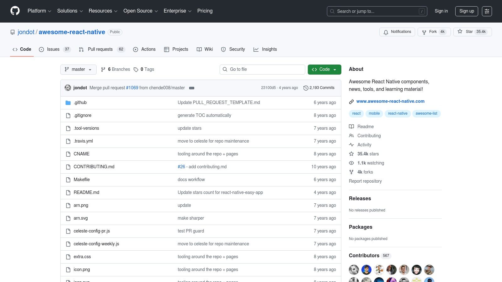
This community-driven list is perfect for the research phase of a project, providing inspiration and a broad overview of what’s available. By browsing its categorized links, you can quickly compare different libraries and find the perfect fit for your app’s unique requirements without having to rely solely on popular search results.
Key Features and Implementation
As a public GitHub repository, Awesome React Native is completely free to access. Its value lies not in installable code but in its well-organized collection of external links.
| Feature | Description |
|---|---|
| Curated Resources | A massive, community-vetted list covering components, navigation, utilities, and learning materials. |
| Discovery Platform | The UI section contains links to dozens of libraries, from comprehensive kits to single-purpose components. |
| Community Driven | Content is kept relevant through community contributions and pull requests, reflecting current trends. |
| Installation | Not a library; it provides links to other repositories, each with its own installation instructions. |
Not applicable - This is a resource list, not an installable package.
To use a library found here, follow its specific installation guide.
Pros:
- Excellent for discovering new or specialized UI libraries beyond the most popular options.
- Provides a broad overview of the React Native ecosystem in one place.
- High-signal curation helps you find quality resources quickly.
Cons:
- The list may contain links to older or unmaintained projects.
- It’s a directory, not a library, requiring you to vet each external resource yourself.
Website: https://github.com/jondot/awesome-react-native
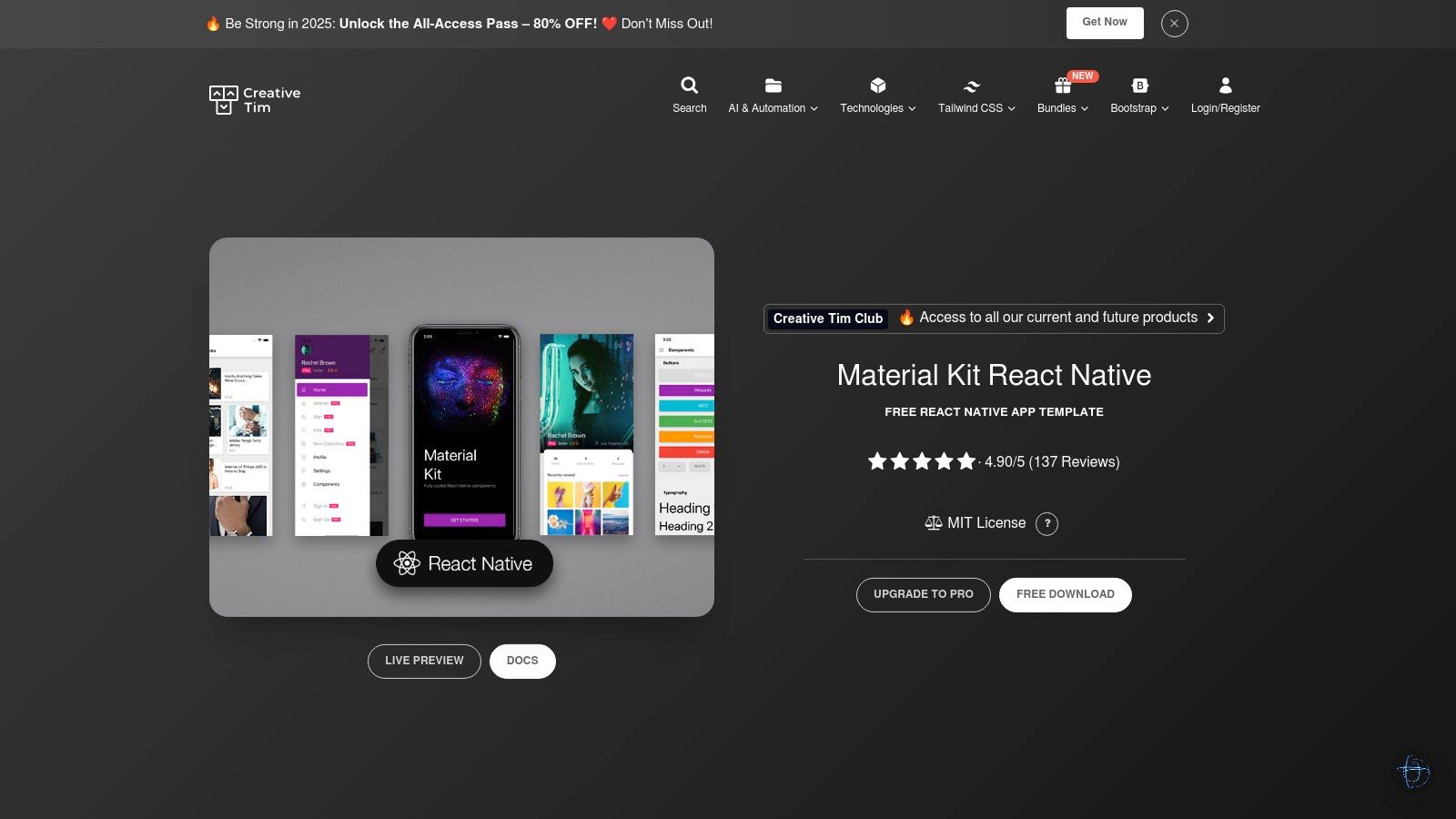
11. Creative Tim – Material Kit React Native
Material Kit React Native by Creative Tim is a fully coded React Native UI library and template built on top of Galio and Expo. It stands out by offering not just individual components but complete, ready-to-use example screens. This makes it an exceptional tool for rapid prototyping and for developers looking to accelerate their app delivery with pre-built, beautifully designed interfaces that follow a Material-inspired visual language. It offers both a free version for getting started and a comprehensive PRO version with more components and screens.
The primary advantage of this kit is its focus on productivity. By providing over 200 component variations and numerous example screens (like Profile, Settings, and Onboarding), developers can jumpstart their projects without building everything from scratch. After scaffolding your app, you will want to ensure its stability through a solid workflow, so it is a good idea to learn more about React Native testing methodologies.
Key Features and Implementation
The free version is open-source, while the PRO version offers extended features under a commercial license. The template is well-documented, showing how to integrate the screens and customize the components.
| Feature | Description |
|---|---|
| Component & Screens | Offers 200+ component variations and multiple pre-built screens like Login, Profile, and Settings. |
| Technology Stack | Built on the Galio.io framework and fully compatible with the Expo ecosystem for easier development. |
| Design Language | Provides a clean and modern Material-inspired design that is easily customizable. |
| Installation | Can be set up quickly by cloning the repository and installing dependencies via npm or yarn. |
Clone the repository
git clone https://github.com/creativetimofficial/material-kit-react-native.git
Navigate to the project folder and install dependencies
cd material-kit-react-native npm install
Pros:
- Significantly accelerates development with ready-to-use, fully coded screens.
- Clear licensing with a free version for small projects and a straightforward upgrade path to a PRO version.
- Based on Expo and Galio, which simplifies the development and build process.
Cons:
- The template’s structure can be opinionated, potentially requiring significant refactoring for highly complex or custom applications.
Website: https://www.creative-tim.com/product/material-kit-react-native
12. CraftReactNative
CraftReactNative is not a traditional React Native UI library but a curated marketplace for production-ready, pre-built UI templates and flows. It offers complete, themed, and animated screen collections, delivered as private GitHub repositories after purchase. This resource is ideal for developers and startups looking to accelerate their app development by starting with professionally designed and coded user interfaces, complete with TypeScript support and modern aesthetics.
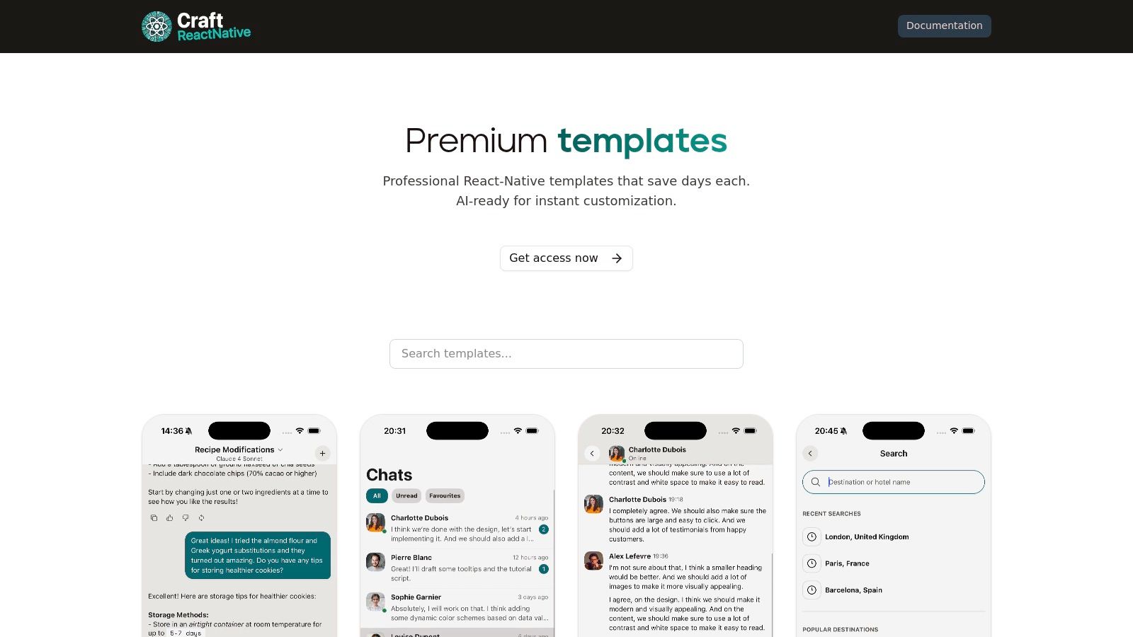
The platform’s unique value proposition is in providing entire user flows, such as onboarding, paywalls, and social feeds, which saves significant development time. Each template is built with best practices in mind, including support for light and dark modes and accessibility features.
Key Features and Implementation
CraftReactNative operates on a per-seat license model, providing lifetime access and updates to the purchased templates. This direct-to-code approach bypasses the need for component-by-component construction.
| Feature | Description |
|---|---|
| Template Library | Offers over 19 polished screen templates for common flows like onboarding, paywalls, and messaging. |
| Theming System | Built-in light and dark mode support, allowing for easy integration into existing theme providers. |
| Accessibility | Templates are designed with accessibility considerations from the start. |
| Implementation | Instant access to a private GitHub repository upon purchase for easy project integration. |
No installation command is needed.
Access is granted via a private GitHub repository after purchase.
Pros:
- Significantly reduces development time by providing complete, polished UI flows.
- Clear per-seat licensing model with lifetime updates included.
- High-quality code with TypeScript, animations, and theming.
Cons:
- This is a paid resource, requiring a one-time purchase.
- Templates may require some adaptation to fit a specific pre-existing app architecture.
Website: https://www.craftreactnative.com/templates
React Native UI Libraries Feature Comparison
| Library / Tool | Core Features ✨ | User Experience ★★★★☆ | Value Proposition 💰 | Target Audience 👥 | Unique Selling Points 🏆 |
|---|---|---|---|---|---|
| React Native Paper | Material Design 3, theming, accessibility, Expo demos | Consistent design, strong accessibility | Free, open source | Designers & developers seeking Material UI | Material You support, maintained by Callstack |
| NativeBase (→ gluestack-ui) | Utility-prop styling, ARIA accessibility, demos | Mature ecosystem, good cross-platform | Free, maintenance mode | Teams needing solid UI libs, transitioning | Large community, clear gluestack transition |
| React Native Elements (RNE) | 30+ cross-platform components, Expo demos, VSCode snippets | Friendly API, active community | Free, open source | Quick prototyping and starter projects | TypeScript support, community-driven |
| Wix React Native UI Lib | Theming primitives, design-system workflow, Expo demo | Robust, production-proven | Free, open source | Product teams standardizing design systems | Backed by Wix, modifier-based design systems |
| UI Kitten | Eva Design System, runtime theming, icon integration | Brand customization focus | Free, open source | Teams needing clear branding tools | Eva design integration, starter templates |
| Tamagui | Optimizing compiler, universal components | High performance, scalable design | Free, open source | Performance-focused teams building design systems | Compiler flattening styles for speed |
| Dripsy | Responsive primitives, TypeScript, web+native support | Lightweight, theme-driven | Free, open source | Teams wanting full design system control | Minimal abstractions, strong TS & Expo support |
| Shopify Restyle | Type-safe theme styling, primitives, example app | Improved dev experience, consistent styling | Free, open source | Developers building custom UI libs | Backed by Shopify, strong type safety |
| React Native Directory | Package discovery, filters, popularity metrics | Fast lookup, regularly updated | Free | Developers searching React Native UI libs | Comprehensive directory with public API |
| Awesome React Native | Curated resource collection, UI component links | Broad resource access | Free | Researchers, discoverers of React Native tools | High-signal curation, community-driven |
| Creative Tim – Material Kit | 200+ components, Expo template, example screens | Accelerates prototyping | Free & PRO versions 💰 | Developers needing ready-made templates | Ready-to-use screens, clear upgrade path |
| CraftReactNative | 19+ screen templates, accessibility, private repo | Polished UI flows, licensed resource | Paid 💰 | Teams needing production-ready templates | Lifetime updates, private GitHub repo |
Integrating Your UI Library with a Modern CI/CD Workflow
Navigating the landscape of React Native UI libraries can feel overwhelming, but as we’ve explored, the ecosystem is rich with powerful and diverse options. From the Material Design-centric approach of React Native Paper to the highly performant, style-agnostic system of Tamagui, there is a solution tailored for nearly every project requirement. Your choice will ultimately hinge on a careful balance of project scale, design system specificity, performance goals, and team familiarity.
The journey, however, doesn’t end once you’ve selected and implemented a library. In fact, that’s where the real work of building, iterating, and maintaining a high-quality application begins. The true value of a well-chosen react native ui library is realized when it enables your team to move quickly, respond to user feedback, and ship updates with confidence.
From Component Choice to Continuous Delivery
Choosing the right library is a strategic decision that directly impacts your development velocity. A component kit with excellent documentation like React Native Elements (RNE UI) can accelerate initial development, while a utility-first library like Dripsy might offer greater long-term flexibility. Regardless of your choice, the goal remains the same: to create a beautiful, functional user interface that can evolve.
To make this evolution seamless, you must consider factors beyond the initial implementation. Think about the long-term maintenance and update process. How will you fix a minor styling bug that affects a core component? What is your process for rolling out a small UI enhancement without forcing users through a lengthy app store update cycle? This is where modern CI/CD practices, specifically Over-the-Air (OTA) updates, become a critical part of your toolkit.
Actionable Next Steps: Making Your Selection
To solidify your decision, consider these final steps:
- Prototype with Your Top 2-3 Choices: Build a small, non-critical feature screen using your shortlisted libraries. This hands-on experience will reveal more about a library’s developer experience and limitations than documentation ever could.
- Evaluate Community and Maintenance: Check the GitHub repository for recent commits, open issues, and pull request activity. A vibrant, active community is a strong indicator of a library’s long-term viability.
- Align with Your Design System: If you have an existing design system, assess how easily each library can be themed or customized to match your brand’s specific tokens, such as colors, spacing, and typography. Libraries like Shopify Restyle or UI Kitten excel in this area.
- Plan for Post-Launch Iteration: Your work isn’t done at launch. Integrate an OTA update solution into your workflow from the beginning. This allows you to push visual tweaks, hotfixes for UI bugs, and other cosmetic changes directly to your users, bypassing the delays of app store reviews and ensuring your app always looks and feels polished.
Ultimately, the best react native ui library is the one that not only meets your immediate technical needs but also empowers your team to build and iterate efficiently for years to come. By pairing your chosen library with a robust deployment strategy, you create a powerful flywheel for continuous improvement and an exceptional user experience.
Ready to accelerate your development cycle and push UI updates instantly? Integrate CodePushGo into your workflow to deploy changes from your React Native UI library directly to users’ devices, skipping the app store. Get started with seamless Over-the-Air updates today at CodePushGo.